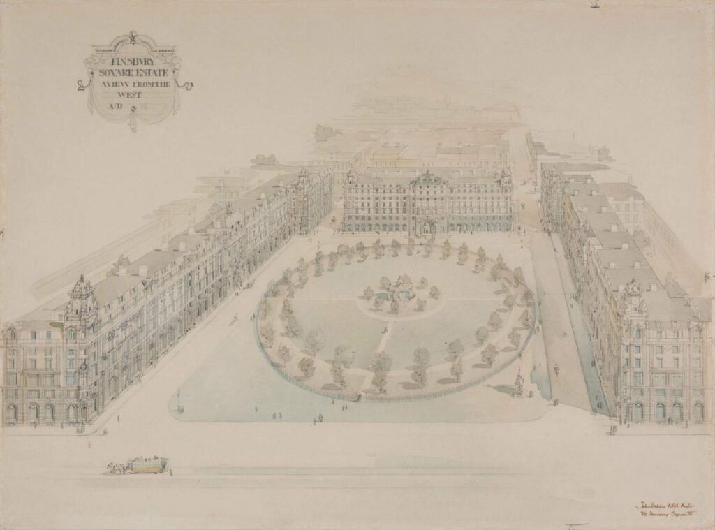
The area of Finsbury in north London became a borough in 1900 and proposals rapidly appeared to replace the terraces of George Dance the Younger’s Finsbury Square and Finsbury Circus with a large volume of continuous office blocks.
John Belcher’s proposal seems to have been built only in part some four years later, with Royal London House — its landmark element — following exactly the language and high profile of the general scheme in his aerial drawing. This “celebration of commerce” (in Roy Hattersley’s words) helped suggest a new scale for the city, though still presented along the lines of a parade and plaza, with its entry towers and markers, rather than the street canyons of Manchester or Chicago.
Speed and location
In Chicago itself, Frank Lloyd Wright’s Midway Gardens was a new type of urban emplacement — a megablock of dining, entertainment and performance space, both enclosed and open; and its position to the south of the city centre was indicative of a new pattern of growth to which the electric railway was key, just as the elevator was essential to the skyscraper.
Wright’s efforts to detail and ornament the scheme spoke to speed and location — landmarking with pylons and towers. But the material language and texture had another purpose: Midway was one of the few built instances among a vast catalogue of sculpturally adventurous metropolitan structures in concrete that Wright proposed in the years immediately after his return to Chicago from Europe in the hope of weaving together a modern, unified city landscape like that of Otto Wagner’s Grossstadt, fit to new functions and ideas.
It is the idea of the city conceived as a whole to which Nicholas B Vassilieve returns in his fashion in a setback study from the 1940s, which animates Le Corbusier in his projected campus for Olivetti at Rho-Milan, and of which Ugo La Pietra and Adolfo Natalini are dreaming in their metropolitan visions of the 1960s.
In the wake of its destruction by fire in 1871, Chicago had emerged, with the railroad as its engine of growth, as the hub for the product of a vast developing region of agricultural, mineral and timber resources that furnished consumer goods throughout the American economy. As the small city rapidly grew into a working metropolis, its remaining wooden buildings were torn down and a system of large-scale engineering through masonry and steel frames developed — of which Sullivan’s shoe factory was an early example.
A model for modernity
As they appeared in print, these Chicago frames became an international model for how to engineer buildings at a modern scale and organise and express their functions in economical and efficient fashion. Daniel Burnham uses the frame to add skyscraper dimensions to a city bank. Lacking a corner or streetfront to flag the new structure, but in a city now seen from elevated trains and raised roadways, Burnham used the roof, with its finials, elevator shaft and water tower, as a landmarking feature.
Mies van der Rohe – probably learning from Richard Neutra’s recently published construction photographs of Chicago — proposed a steel-frame office building for the Hindenburgplatz in Stuttgart, whose contrasting presence and modernity was announced not only by its projection into the street and its shift in scale, but – as the collage so cleverly shows — by the lightness of its palette and constructive language.
The monumental low-rise masonry-clad steel frame became the standard American urban vocabulary for commercial and public works in the 1930s, from banks and hotels to post offices and libraries. In a department store project for Springfield, Chicago’s Burnham firm shows an extended version: three full cubes along one street, and a monumental entry on the other.
The rendering uses charcoal on trace to suggest a windy early evening after rain, thereby making the most of the dynamics of motion, the corner, and the light issuing through the show windows. These were cinematic conditions resonant of metropolitan life and vital to attracting commerce, which Burnham makes more emphatic with a dark marble frame at ground level and a narrow first-storey string of windows.
The changing metropolis 1900–1930s
Work on Paper
– Niall Hobhouse and Nicholas Olsberg
Part II: Unifying the city landscape: 1900–1930s
The area of Finsbury in north London became a borough in 1900 and proposals rapidly appeared to replace the terraces of George Dance the Younger’s Finsbury Square and Finsbury Circus with a large volume of continuous office blocks.
John Belcher’s proposal seems to have been built only in part some four years later, with Royal London House — its landmark element — following exactly the language and high profile of the general scheme in his aerial drawing. This “celebration of commerce” (in Roy Hattersley’s words) helped suggest a new scale for the city, though still presented along the lines of a parade and plaza, with its entry towers and markers, rather than the street canyons of Manchester or Chicago.
Speed and location
In Chicago itself, Frank Lloyd Wright’s Midway Gardens was a new type of urban emplacement — a megablock of dining, entertainment and performance space, both enclosed and open; and its position to the south of the city centre was indicative of a new pattern of growth to which the electric railway was key, just as the elevator was essential to the skyscraper.
Wright’s efforts to detail and ornament the scheme spoke to speed and location — landmarking with pylons and towers. But the material language and texture had another purpose: Midway was one of the few built instances among a vast catalogue of sculpturally adventurous metropolitan structures in concrete that Wright proposed in the years immediately after his return to Chicago from Europe in the hope of weaving together a modern, unified city landscape like that of Otto Wagner’s Grossstadt, fit to new functions and ideas.
It is the idea of the city conceived as a whole to which Nicholas B Vassilieve returns in his fashion in a setback study from the 1940s, which animates Le Corbusier in his projected campus for Olivetti at Rho-Milan, and of which Ugo La Pietra and Adolfo Natalini are dreaming in their metropolitan visions of the 1960s.
In the wake of its destruction by fire in 1871, Chicago had emerged, with the railroad as its engine of growth, as the hub for the product of a vast developing region of agricultural, mineral and timber resources that furnished consumer goods throughout the American economy. As the small city rapidly grew into a working metropolis, its remaining wooden buildings were torn down and a system of large-scale engineering through masonry and steel frames developed — of which Sullivan’s shoe factory was an early example.
A model for modernity
As they appeared in print, these Chicago frames became an international model for how to engineer buildings at a modern scale and organise and express their functions in economical and efficient fashion. Daniel Burnham uses the frame to add skyscraper dimensions to a city bank. Lacking a corner or streetfront to flag the new structure, but in a city now seen from elevated trains and raised roadways, Burnham used the roof, with its finials, elevator shaft and water tower, as a landmarking feature.
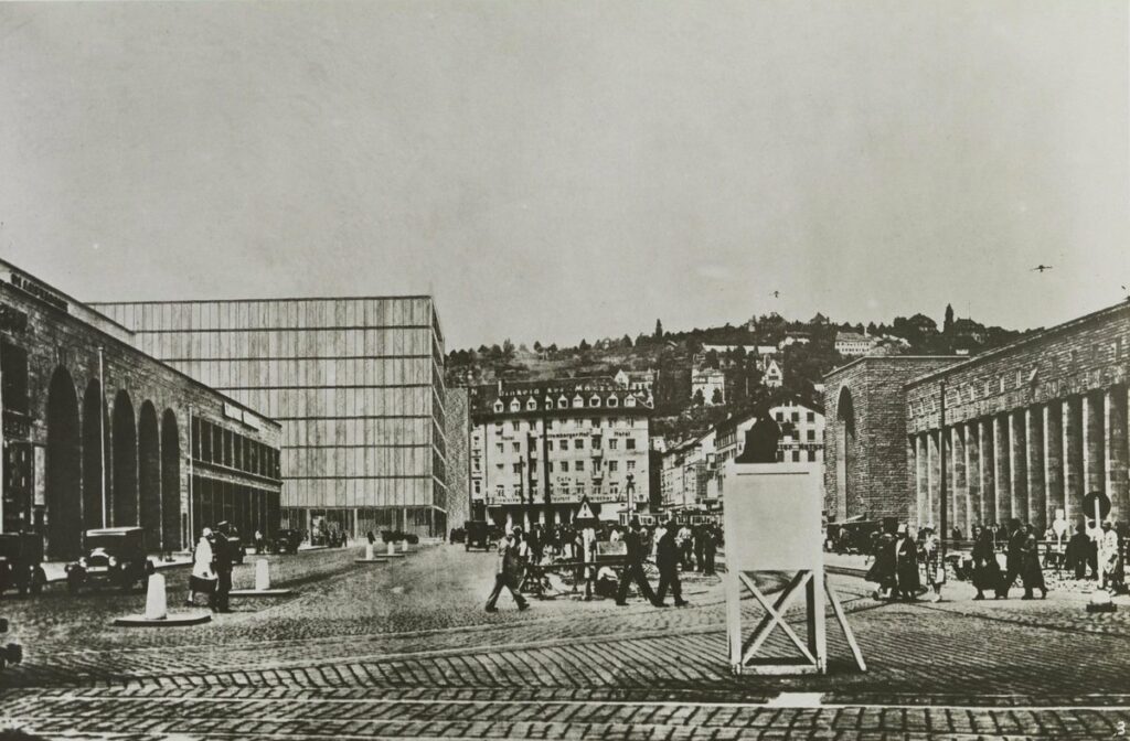
Mies van der Rohe – probably learning from Richard Neutra’s recently published construction photographs of Chicago — proposed a steel-frame office building for the Hindenburgplatz in Stuttgart, whose contrasting presence and modernity was announced not only by its projection into the street and its shift in scale, but – as the collage so cleverly shows — by the lightness of its palette and constructive language.
The monumental low-rise masonry-clad steel frame became the standard American urban vocabulary for commercial and public works in the 1930s, from banks and hotels to post offices and libraries. In a department store project for Springfield, Chicago’s Burnham firm shows an extended version: three full cubes along one street, and a monumental entry on the other.
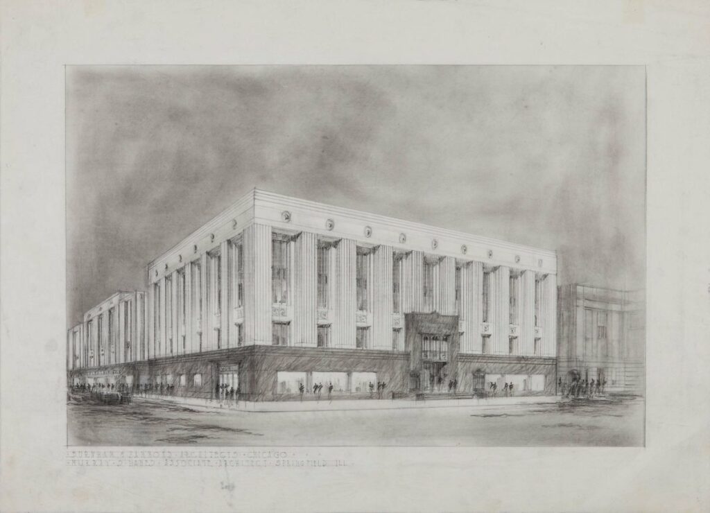
The rendering uses charcoal on trace to suggest a windy early evening after rain, thereby making the most of the dynamics of motion, the corner, and the light issuing through the show windows. These were cinematic conditions resonant of metropolitan life and vital to attracting commerce, which Burnham makes more emphatic with a dark marble frame at ground level and a narrow first-storey string of windows.
Related...
The changing metropolis 1815–1900
– Niall Hobhouse and Nicholas Olsberg
Displaced persons
– Niall Hobhouse and Nicholas Olsberg
The changing metropolis 1940s–1980s
– Niall Hobhouse and Nicholas Olsberg
Category
drawing histories drawing techniques & materials commentaries, rants & reflections Drawing Matter archive: research & collecting
Period
c20th
Architect
John Belcher Hammond Burnham Burnham & Company Ludwig Mies van der Rohe Nicholas Vassilieve Frank Lloyd Wright
Medium
drawing
Tags
urban form public space work on paper (series) DMC projection (axonometric isometric) topographic/cartographic commerce culture