Peter Märkli: My Facade Material
– Editors
The following quotations are from ‘Mein Stoff für Fassaden (My Facade Material)’, a lecture delivered online by Peter Märkli to open a series of five talks for the Architecture Foundation. The quotations are presented here in a loose fashion, some treated as aphorisms about design, others illustrated with drawings from the collection for the projects referred to in the lecture.
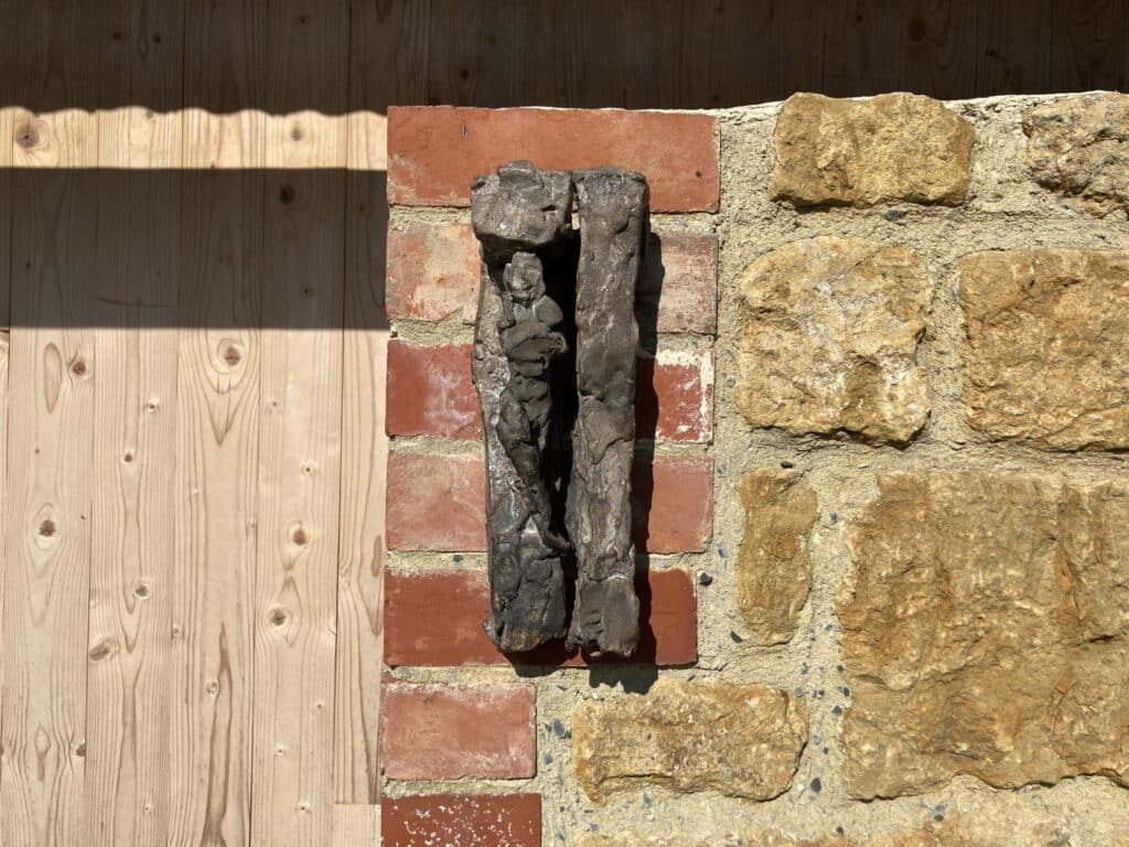
‘Modernism dispensed with columns. And it’s very noticeable that since the 1950s facades have rarely featured sculpture. But it was my good fortune to know the sculptor Hans Josephsohn, whose work was very close to mine in terms of its content, its attempt to create a mood or atmosphere. His sculptures, which engage with the human form, gave me material to work with from another genre.’ […]
‘There was no client, no direct commission, for any of these drawings. Instead, they were ways of exploring the form and the expression of a house – things I was still looking for in the 1970s, and these drawings helped me find them. When I had the good luck to get a commission I was able to refer back to some of these things. Without this work I would not have been able to build – to realise – the buildings.’
‘These drawings refer back to the basic grammar of the elements.’
‘These drawings have to be small – they cannot be large because they are not about detailing. They’re explorations of principles. They capture the essence of things in few lines that nevertheless encapsulate a lot of possibilities.’
‘These are hardly what I’d call virtuoso drawings. They’re drawings that I’ve had to work at, correct. That is why there are so many of them. The work is not a virtuoso exercise. It’s about thinkings things through, looking for something that doesn’t yet exist in this form.’
The Haus Kühnis (gross & klein), Trübbach, Switzerland, 1982:
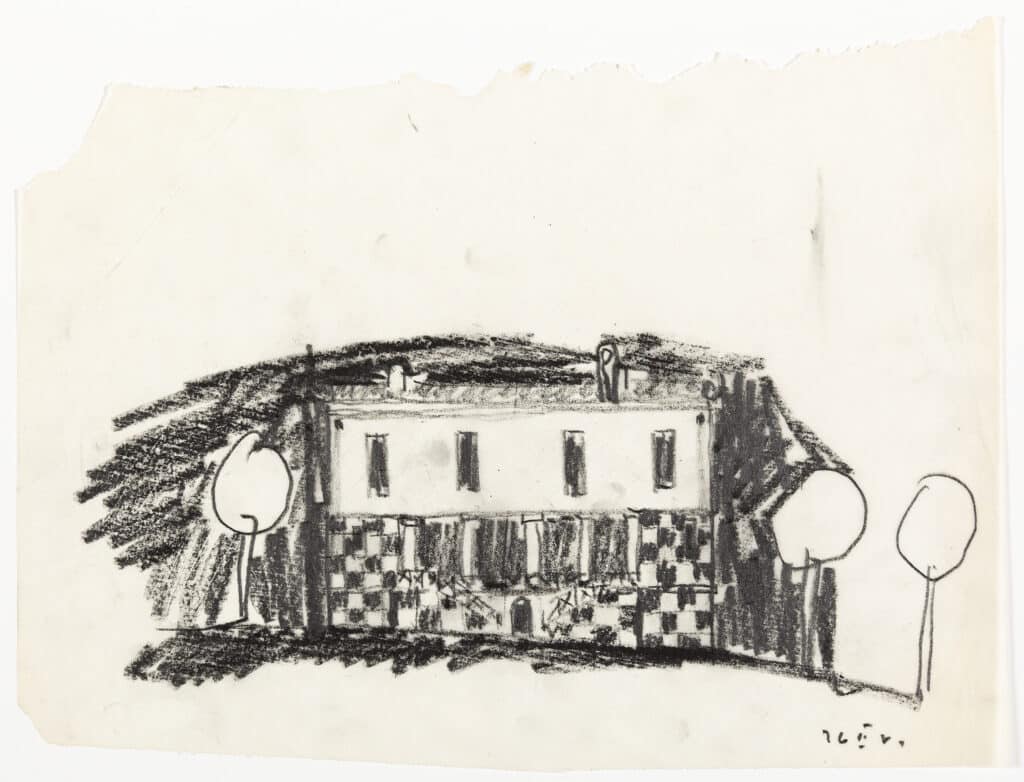
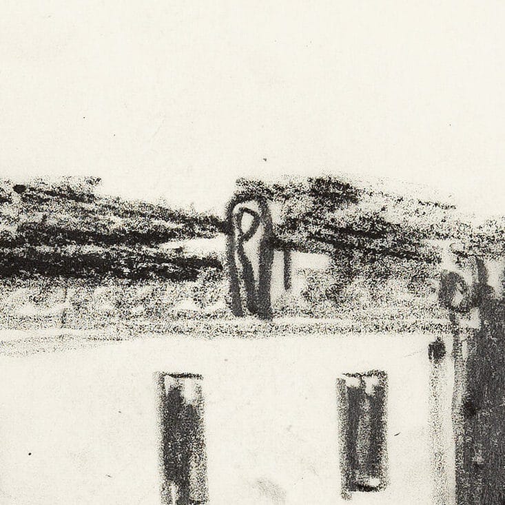
‘You have a striped plinth, these columns, and the windows above and then, on the right, to break the symmetry, a relief by Josephsohn…’
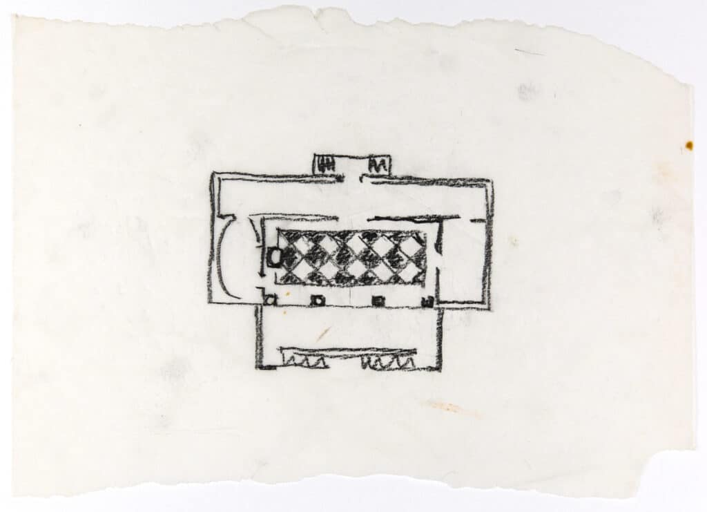
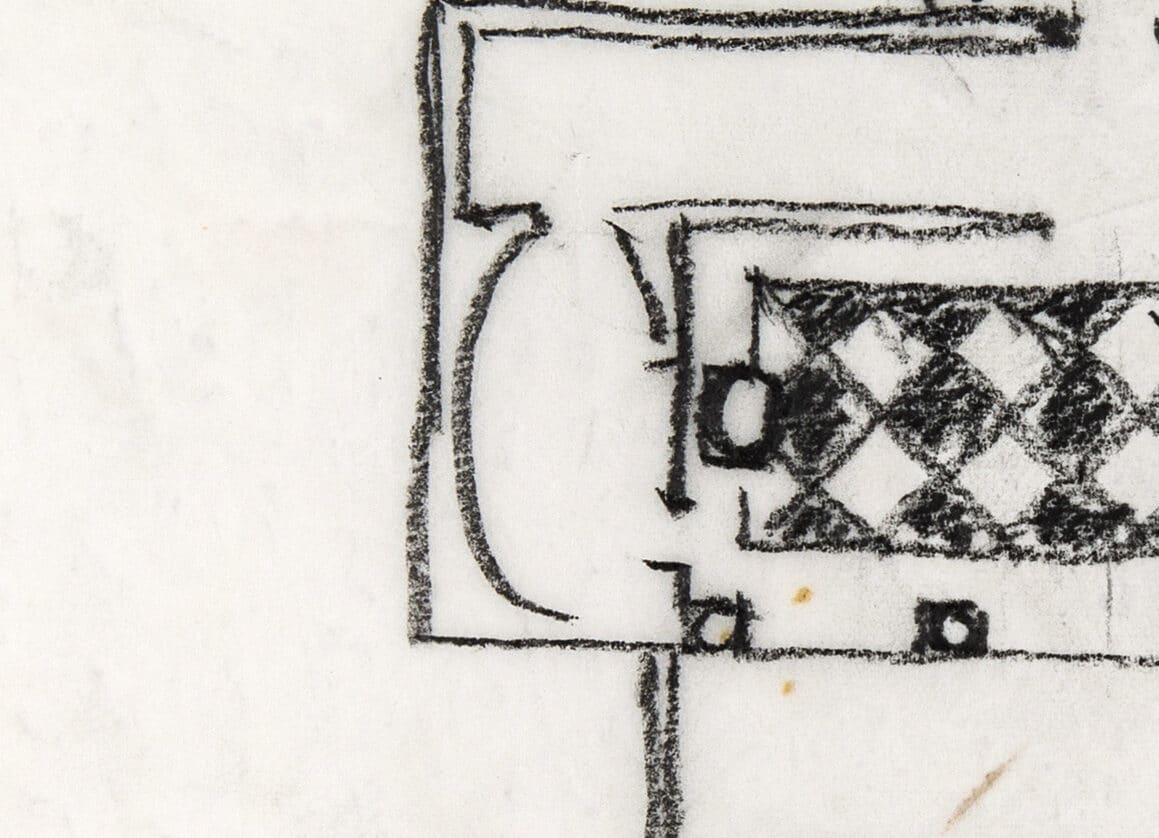
‘The plan, with the main living space, kitchen, an oval library and stair that runs continuously from the basement to the upper floor, and a terrace.’
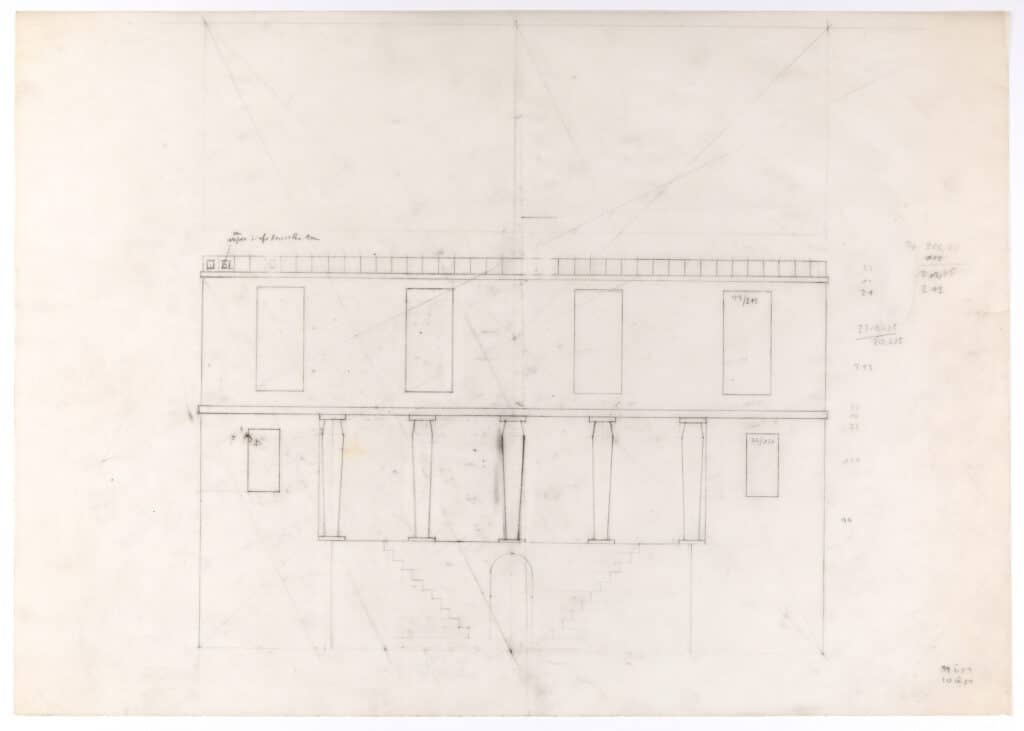
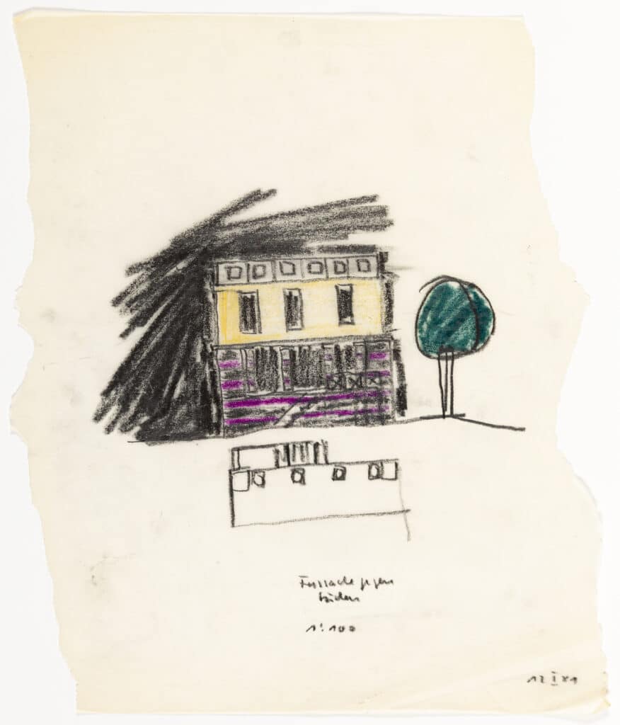
‘Another sketch of the small house next door. It started off with a sloping roof, but then I thought it wouldn’t look so good from the garden. Based on what I’d seen of the constructions of the other house, I decided to make a horizontal cornice – a wall covered with cassette panels. […] Doing away with the pitched roof gave the house a completely different form.’
‘ninety-nine percent of the time in our profession you have a main facade, with the other sides being secondary.’
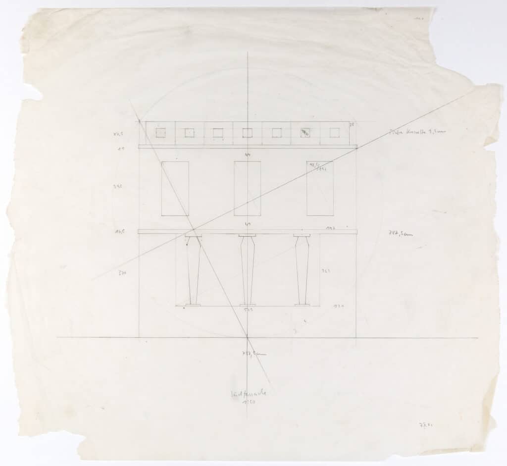
‘In the sketch about there are some proportional studies […] The whole house is inscribed in a circle. I started investigating proportional systems while I was still at the ETH, because I found it incredibly hard to define the measurements on drawings down to the last millimetre.’
‘In the third house, the main facade again looks onto the garden. The three columns, the central column, the plinth, the stairs – all had already been tried out in the drawings.’
Haus Hobi, Sargans, Switzerland, 1983:
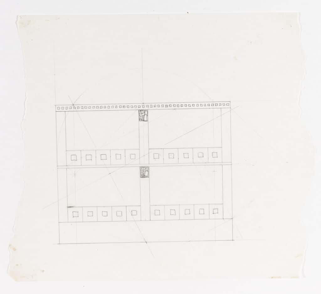
‘[…] on this pillar you have two reliefs places at the points where the vertical intersects with the horizontal. Because these reliefs are plastic figures they cast shadows. Shadows are essentially darkness, or blackness […] The American abstract expressionist Barnett Newman talked about how black has a pure quality – for the Americans, it was one of those ‘pure ideas’ that could transform painting into an abstract work with the meaning that was evident to the viewer. He compared this with the European artists who could transform the original motif into something with an almost transcendental quality […]’
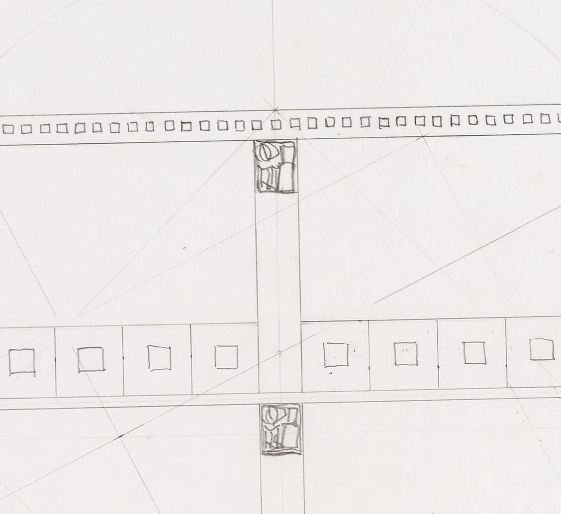
‘And this point – the intersection of the vertical and the horizontal – is one of the real themes of architecture, along with the wall pierced by openings. Apart from those, we don’t have many more themes to work with.’
‘Without those two reliefs, the expression would have been too stark. We were able to offer Josephsohn’s work into these simple houses because he offered them at a price that matched the low construction budget – rather than their market value.’
‘There’s a story about these reliefs. We were onsite, installing them on the facade, and one of the construction workers said to me: “What’s that about? How much did they cost?” I told him so many thousand francs and he said: “But you could buy a car for that!” I said, “That’s true, but we need them for the form of the house, otherwise it won’t work.” So we put these reliefs on the pillars and I dragged the construction workers down to the bottom of the garden to look at the finished house from a distance. Then we took the sculptures away again – and they could see the difference they made.’
Studies without projects:
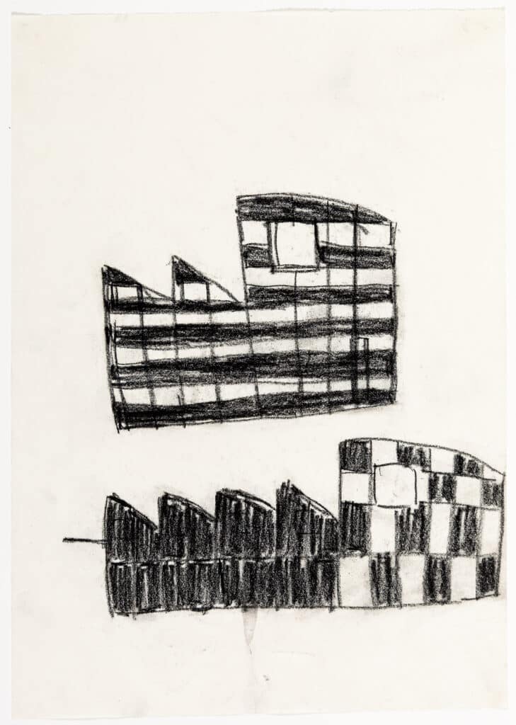
‘The zoning regulations allowed for three storeys, so I proposed that the main living space – the equivalent of a large two room apartment – should be at the top of the house, for the best views of the the beautiful landscape, the mountains and the valley.’ [Regarding designing a single family house in Azmoos, St. Gallen, Switzerland, 2000]
‘I went back to those old drawings with the chequerboard pattern, thinking that if the walls were painted in that way it would allow these openings – these geometric breaks in the wall – to be integrated into the fields of colour without detracting from the expressive volume. […] the eye is deceived in a way.’
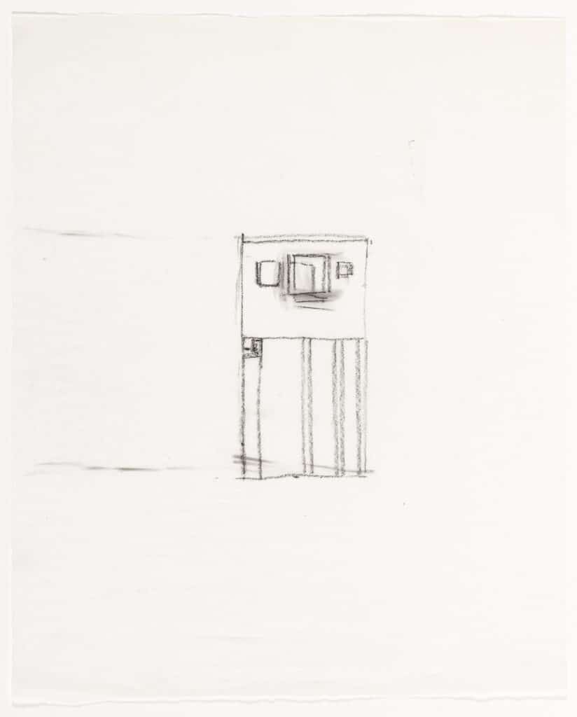
‘You have a series of buildings with pillars and they are no longer symmetrical but are sometimes bundled, and then you have larger and smaller intervals between them. Then there’s a wide pillar at the point where it connects with the upper part of the building.’
‘More than a conscious thought process, the act of making all these drawings will suddenly open up an incredible range of possibilities […]’
Watch the full lecture below:
