Sigurd Lewerentz: Siting the Axonometric
One way to think about an axonometric drawing is as a perspective with the vanishing point at infinity. This means that the lines of projection are parallel, which assures dimensional consistency. Early treatises, for example, spoke of parallel projection as analogous to shadows cast by the sun; not, strictly speaking, at an infinite distance, but a distance so large as to make any small deviation irrelevant. It also means that the delineated object appears to float in an extended, abstract space. Perspective locates both viewer and vanishing point in a finite space, scaled to the human body. Historically speaking, axonometrics rarely incorporated reference to ground, context or point of view. [1]
This double valance – simultaneously connoting technical objectivity and infinite, abstract space – made the axonometric a perfect vehicle for artists of the early twentieth century avant-gardes. ‘Suprematism has advanced the ultimate tip of the visual pyramid of perspective into infinity,’ wrote El Lissitsky in his 1925 manifesto ‘K and Pangeometry’. Paintings and drawings by Theo van Doesburg and Cornelis van Eesteren, Herbert Bayer (and Lissitsky himself) are constructed on the basis of this same post-perspectival logic.

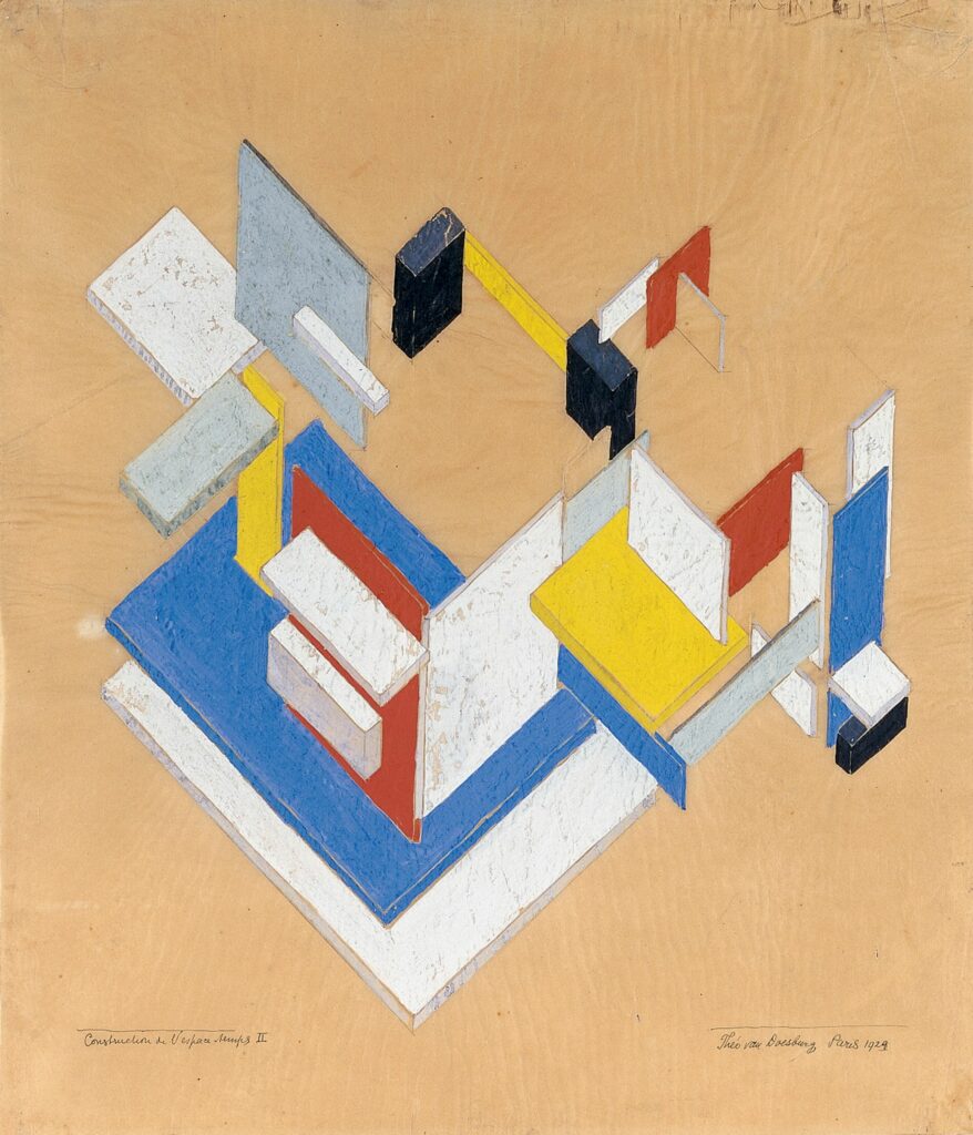
The axonometric in turn was the preferred form of representation for the American neo-avant-gardes of the 1960s. In drawings that explicitly recall van Doesburg and van Eesteren, Peter Eisenman made strategic use of both the objectivity and the spatial ambiguity of the axonometric. John Hejduk’s point of departure for the Diamond series, beginning in 1962, was also the Dutch avant-garde. Mondrian’s paintings provided a plan schema for Hejduk, while his strangely flattened 90-degree projections took advantage of the simultaneous compression and extension of the visual field implied by the infinite vanishing point to recall the push/pull of cubist space. [2]
Compelling as they are, the Diamond drawings are, in their own way definitive: a line of visual experiment brought to conclusion. Flat, 90-degree projections by Stanley Tigerman, Arata Isosaki, James Stirling and Toyo Ito in the 1970s marked a wider acceptance of the technique and a stronger focus on the autonomous object. Isosaki uses shade and shadow to clarify the formal structure, and incorporates cast shadows, which lock the building into the ground. In his frontal ‘up-views,’ Stirling’s concern is the tension between spatial depth and frontality, and the projection of metal canopies or awnings out from the datum of a masonry facade. [3] Finally, in the San Rocco covers drawn by Michele Marchetti, 90-degree projection sheds all reference to the avant-gardes of the last century. [4] No longer a web of lines implying depth, these are closed figures floating on a white ground, aligned with a contemporary visual culture informed by immediacy and recognisability.
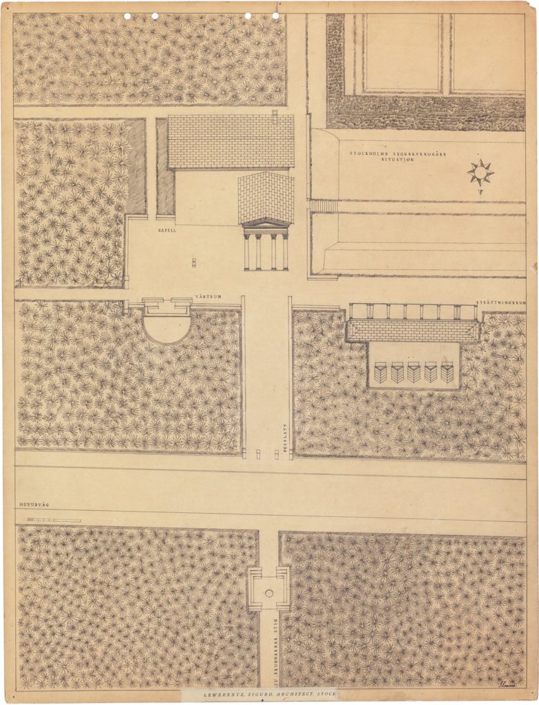
There is an extraordinary drawing [above] made by Sigurd Lewerentz around 1924 that appears to complicate this familiar chronology. [5] Lodged within a gridded field of trees and pathways, the Resurrection Chapel at the Woodland Cemetery is shown simultaneously in roof plan and elevation. The view is from north to south. The logic of the drawing is clear: the portico that terminates the long allée through the forest leading to the chapel is the presented in a true elevation, projecting forward from the blank surface of the chapel’s side wall. The roof over the pediment extends back in space, marking the depth of the portico in plan. The pitched roof over the nave, at 90 degrees to the portico, marks out the width of the building. Each of the parts is insistently flat, but their juxtaposition creates a three-dimensional effect, in tension with the overall flatness of the page. The desire to explain through drawing the relationship between the building and its site seems to have led Lewerentz to something very much like a 90-degree axonometric.
So, did Lewerentz invent the flattened 90-degree axonometric four decades years before Hejduk? I think the answer is ‘no,’ but also that the question is wrongly put. In the first instance, it is not a question of invention because the form existed long before Lewerentz (or Hejduk). Lewerentz’s drawing, in particular, looks not forward but back, to already existing pre-perspectival forms of representation. [6]
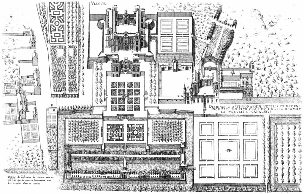
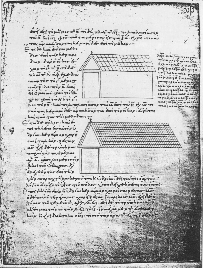
An eleventh-century transcription of Heron of Alexandria’s geometric treatise Metrica (c. 60AD), for example, shows an accurate projection of the side and front of a simple building, 90 degrees to one another. Drawings by Jacques Androuet du Cerceau from the late sixteenth century show complexes of buildings accurately projected 90 degrees from the primary facade. And there is a vibrant tradition of anonymous and vernacular pictorial ‘maps’ of towns and villages from the late eighteenth to the early-twentieth century that mix plan and elevation to achieve the effect of 90-degree projection.
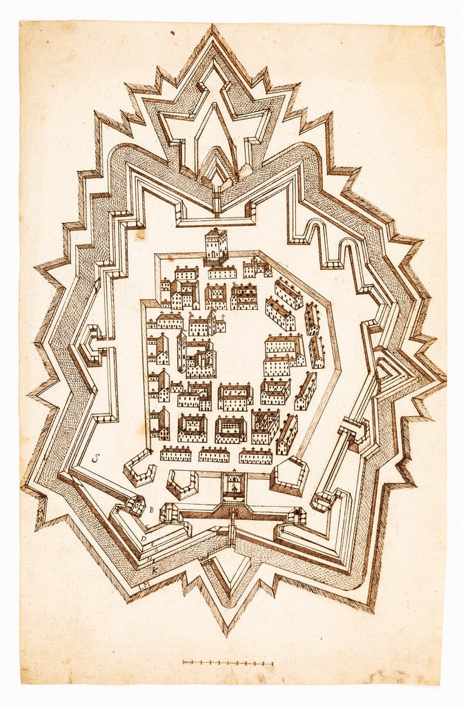
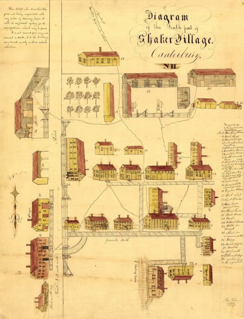
What all these examples have in common is a close attention to the relationship between the object and its site. It is not accidental that du Cerceau uses the form to depict palace complexes; it also appears in drawings of fortifications, where a frontal plane is often difficult to locate. None of these is about an autonomous object floating in abstract space. Lewerentz’s drawing is distinct in intention, not only from Hejduk, but from the entire avant-garde project. His architecture is inseparable from its site and in dialogue with nature. Drawn the same year as the publication of Lissitsky’s ‘K and Pangeometry,’ his 90-degree projection perfectly serves his intention to describe the intricate relationship of the chapel to its wooded site and the burial rituals it serves.
The building itself is strange and compelling. The chapel has a precise liturgical program, and needs to be understood in that context, but the programmatic narrative does not exhaust its meaning. [7] Gunnar Aspland’s earlier Woodland Chapel has a concentrated intensity, in part due to its diminutive scale, but also to its synthesis of archetypal vernacular form and classical language. Asplund’s chapel belongs at once to its wooded site and to the man-made culture of architecture. Its modest columns perfectly mirror, and extend, the rhythm of the trees that surround it. It is, despite its austerity, a comforting space: intimate, almost domestic. Lewerentz’s chapel stands apart, in a clearing framed by low walls. Approached axially, its classicism is more literal, and the scale suggests monumentality. It is hard, sober and austere. But the axial approach confounds the viewer. Once out of the corridor of trees, the wider vista reveals that the portico is not at its customary location on the building’s front, but on the side, creating a tense asymmetry. Lewerentz achieves an uncanny effect through the use of known elements in unfamiliar relationships. Each part of the building – the portico, the nave, the roof, the south-facing window and the small door to the west – is conventional and is complete in and of itself. The portico is literally freestanding, its rear tympanum facing the blank side wall, and the roof stopping a few centimeters short. The elements are locked onto place by taut plan geometries. The overall effect is calm and dignified, but there is an underlying tension that has nothing to do with collage, or the dynamic asymmetries of the avant-garde. It is a more existential disquiet: a disquiet that speaks of once secure certainties eroded from within.
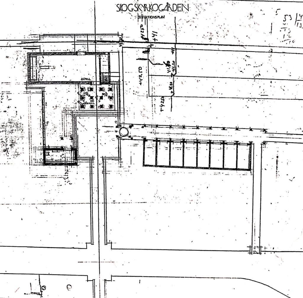
All this can be explained through the circumstances of the site and design process, but that explanation in no way diminishes the unsettling effect of the building. Early designs showed the main body of the church oriented north-south, which would have allowed an entry on axis with the pathway at the gable-end of the building. Church authorities, however, insisted on the conventional east-west orientation. Lewerentz complied with this demand, but left the portico in place to terminate the axis, resulting in the unlikely – and rather anti-classical – assemblage. The plan reflects the ‘rite of passage’ burial ritual, which dictates that mourners enter and leave the chapel through separate entries; the portico needed to be located as far away from the altar as possible without occupying the west wall. [8] The layout is not capricious, and is logical in its own way. Its rationality makes it all the more powerful: a common-sense solution that produces an uncanny effect.
The interior is restrained and affecting. The space is unexpectedly tall and narrow. Delicate pilasters project lightly from the pale grey plaster walls, nearly invisible. There are no fixed pews; light-weight chairs, in steel and leather are arrayed in the space, which creates a sense of informality at odds with austerity of the space and the hardness of the materials. Four Corinthian columns mark the altar, which faces a low marble catafalque, lightly incised, where the coffin rests in the diffused light cast by the south facing window. At the opposite end is the low, unadorned doorway through which the procession will exit the church, for the final burial. The drawing too is a kind of hybrid, an unlikely assemblage of known parts. On close examination it becomes clear that the drawing is not actually a projection but a construction made from fragments of other drawings.
The bases of the columns, for example, are flat, not rounded as they would be if projected. And the ridgeline of the roof would be displaced from the center in an accurate 90-degree projection. (Curiously, the only element projected on the roof is the chimney stack.) Although some landscape elements are shown three-dimensionally, the sunken burial garden and its stair are shown in a hybrid of plan and projection. Moreover the half-round waiting room and the Bisättningsrum facing the garden are projected in the opposite direction – logically calling attention to their primary elevations, (rather than mechanically showing their backs), implying a completely different orientation for the drawing. [9] This use of multiple projections and implied viewing points recalls the anonymous three-dimensional maps, and reinforces the idea that the chapel is not a singular object, but a small ‘village’ of elements gathered around a square in service of the extended burial ritual.
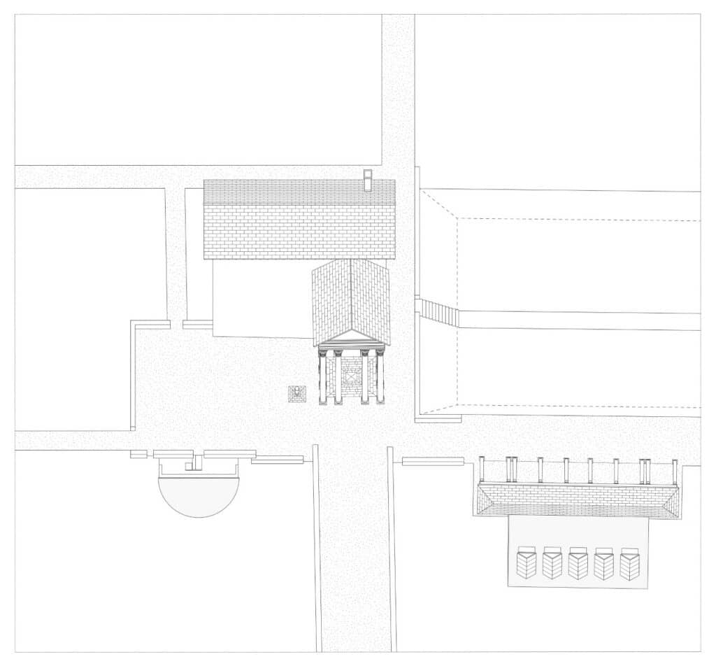
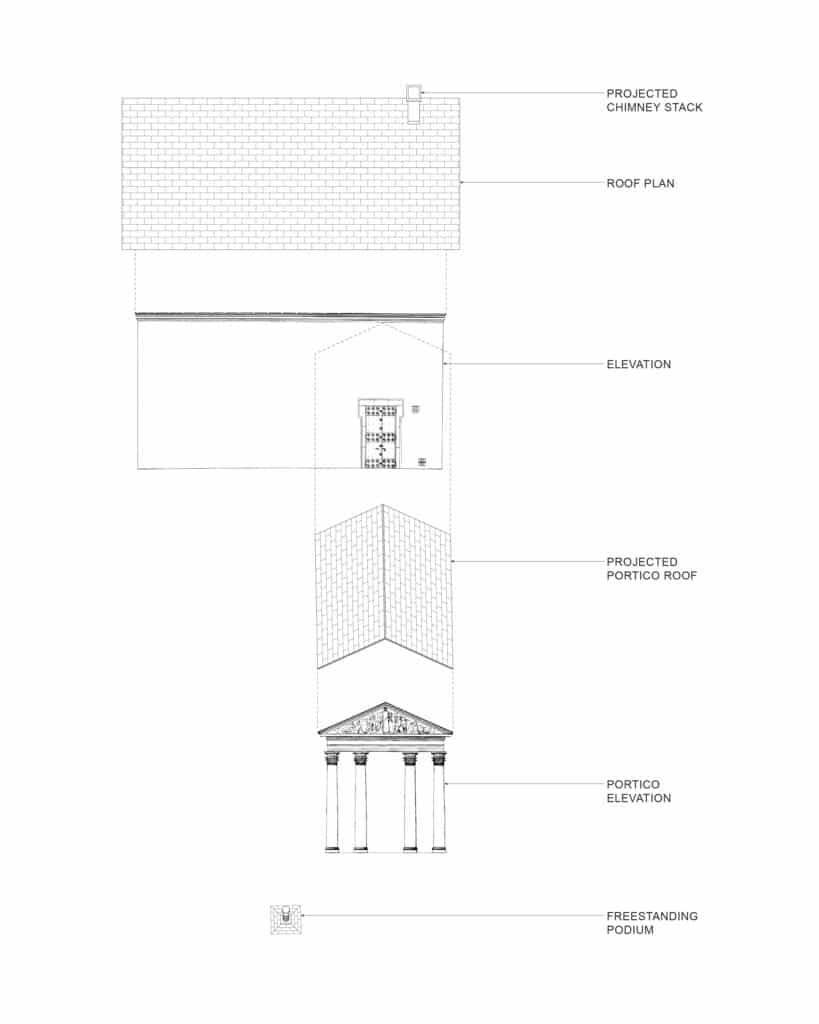
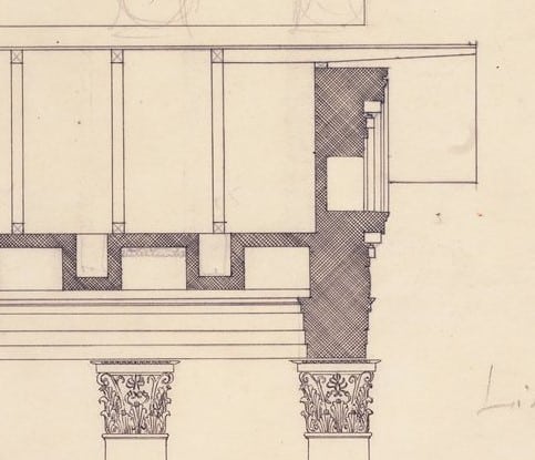
In an effort to better understand the mechanics of the drawing, I constructed an accurate 90-degree projection from the available plans and sections. All of Lewerentz’s liberties are made clear. In the ‘correct’ projection the eaves of the roof cover the cornice of the building’s facade, and cut the profile of the portico roof. Something similar happens to the elevation of the portico, which is shown here skewed rather than rotated. The roof overhang calls attention to a detail: the masonry wall is terminated by a simple cornice; above that a generous undercut allows the roof to float free of the wall below. The roofing itself is supported on lightweight purlins that extend well beyond the wall. The roof detail is at odds with the classicism of the chapel, and anticipates Lewerentz’s later work with its more improvisational approach to construction and detailing. In the reconstruction, the proportions overall become squatter and inelegant, the overhanging roof dominating (and altering the proportions) of the elevation. The tension goes out of the composition. Accurate and consistent is not always better; Lewerentz’s ‘incorrect’ version is more compelling, and better describes the experience of the building, while retaining the fundamentally abstract character of the drawing.
There are two final anomalies. As has often been noted, the portico and the western wall of the chapel are very gently angled to better align with the approach and to reconcile the geometries of the landscape plan. [10] This brings them approximately two degrees out of square, a subtle visual adjustment imperceptible in photographs, and perhaps experienced almost unconsciously on site. Even with a craft-based realisation, such a small visual adjustment (approximately 15cm over the width of the building) would have added a level of complexity to the construction that feels disproportionate to the effect. It was clearly important to Lewerentz and underscores the fact that his classicism is not a rigid formula, but something immediate and felt. Like the entasis of a column, it relates to the body and bodily perception more than to pure geometries. Similarly, the empty forecourt is punctuated by a single freestanding object: a cast-iron drinking fountain resting in the angle between portico and the north facade of the chapel. These fountains, found throughout the cemetery, were designed by Asplund; this one appears in the oblique site plan in a slightly different location. In Lewerentz’s drawings it resembles an inverted Corinthian column. As realised it is more severe, but retains the classical allusion. Like an archeological fragment, this artifact seems to have floated free, a part standing in for the whole system of the classical past, in dialogue with the specific instance of the chapel itself.
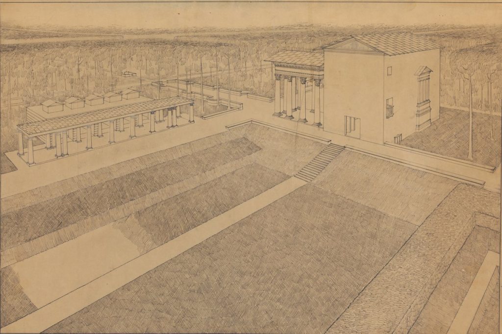
Complementing the oblique site plan is a perspective showing the sunken burial ground in the foreground, framed by the west face of the chapel and the Bisättningsrum to the north [above]. Here too landscape is the primary protagonist. Lewerentz was an extraordinary draughtsman, and every drawing simultaneously anticipates its realisation as construction as well as describing the building in a precisely delineated bodily space. What is striking to me, in both the drawing and in the experience of the building, is the scale and simplicity of the small door in the west wall of the chapel. A simple rectangular opening with a marble threshold, it is entirely without ornament or articulation. The entry from the portico into the chapel is tall and graciously proportioned; this opening is low and wide, to accommodate the coffin and its bearers. The bronze door itself (not shown in the perspective) is recessed, placing it in shadow, which serves to make the cut-out even more elemental: a void in the wall that reveals its thickness. Lewerentz’s profound restraint – which will find full expression in his later work – is foreshadowed here. At the place when the mourners exit the church, the architecture is silent and inexpressive. It acknowledges that nothing need be added to mark the moment of departure, beyond stepping though an unadorned portal into the landscape beyond.
Notes
At a time of limited library access and the impossibility of travel, Caroline Constant, Per-Johan Dahl and Johan Örn of Ark-des were very helpful answering specific questions about the chapel and the drawings. For background see: Caroline Constant, The Woodland Cemetery: Toward a Spiritual Landscape (Stockholm: Byggförlaget, 1994).
- From Atelier Bow Wow to MOS Architects, there is a contrary tendency to populate the axonometric, particularly in an urban context, with numerous figures, cars and other scaled objects. See: Dora Epstein Jones, ‘Little People Everywhere: The Populated Plan’ Log 45, Winter/Spring 2019.
- Stan Allen, John Hejduk’s Axonometric Degree Zero, published by Drawing Matter 2019.
- John Tuomey, Stirling at Stuttgart Rear View / Up Views, published by Drawing Matter 2020.
- Helen Thomas, San Rocco, published by Drawing Matter 2017.
- Although I had seen versions of this drawing published before, usually small and in black and white, it was Helen Thomas’ Free standing: Sigurd Lewerentz, published by Drawing Matter in 2018, that first called my attention to this drawing.
- See Massimo Scolari, Oblique Drawing: A History of Anti-Perspective, (Cambridge, MA; MIT Press, 2012).
- For a detailed analysis of the ritual program and meaning and (to my mind) a convincing reading of the partial rotation of the portico, see: Vaughan Hart, ‘Sigurd Lewerentz and the “Half-Open Door,”’ Architectural History 39 (1996): 181-196.
- Colin St. John Wilson, ‘Sigurd Lewerentz and the Dilemma of the Classical,’ Perspecta 24 (1988): 51–77.
- The Bisättningsrum is the low structure with a modest portico facing the gardens. It is sometimes referred to as the mortuary in English, and indeed, the coffins rest here before the burial. However, the bureaucratic and medical connotation of the English word is far from the sense of this structure. A Swedish friend provided a fuller translation: ‘The room has a special purpose, even though the function is connected to Christian Lutheran practice, where you never have an open coffin – in the older days it was not uncommon that the family requested to have one final “viewing goodbye”, when you actually opened the coffin.’ Bisättningsrum directly translates as: additional/extra (Bi) in the ground/set in the ground (sättning is an old expression for, amongst a range of functions, place in the ground) room (rum). (Personal communication)
- This is the usual interpretation. But looking at the design history, it seems more accurate to say that the chapel is rotated in relationship to the portico, rather than vice versa. The orientation of the portico is fixed by the site geometries and the axes of the Path of the Seven Wells. See the September 1922 plan, above.

– Niall Hobhouse