Simplification
Work on Paper, part II
– Niall Hobhouse and Nicholas Olsberg
The first of these short excursions into work on paper looked at how drawings were used to place built forms in their settings. Grounded in traditions of illustration, they were spacious, suggestive and pictorial.
Architects draw to many purposes. In Part II, on Simplification, we turn from the arts of depiction — sheets that render buildings as landmarks in the mind’s eye – to codes of delineation — outlines, diagrams or analyses in which the structures float free from their settings.
The contexts are the edges of the sheets on which they are drawn, and the rare hint of landscape or human figures inhabiting the frame is simply a device for scale.
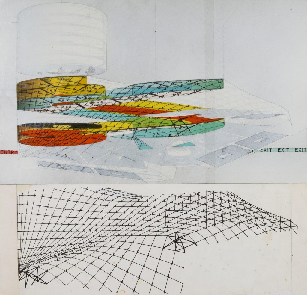
These drawings range from studies that explore patterns of managing movement and observation, like Du Cerceau’s model plan for a fortified chateau, to the skeletons that can underlie a random structure, like the wire frame diagram Michael Webb used to establish a wave form at the never-built Sin Centre, or to narratives of the unseen steps that produce the evolving logic of a design, like Peter Eisenman’s coloured axonometric collages of the intersecting planes that make up the argument of his House VI.
But all drawings for architecture are in some ways acts of simplification, a symbolic system for building or for thinking about how to build.
For countless generations this went two ways. While codes of drawing simplified the building, the limits of the draftsman’s art, even at its most inventive, had a wonderful power to restrain the things we imagined taking shape on the ground.
If you can find no way to translate a fanciful idea for large forms into a pattern of short lines on paper, maybe that fancy has to be
contained.
At long last, Frank Gehry famously declared some 20 years ago, as he introduced his flamboyant new plasticity, we can, with the aid of the computer, build any form in any shape we can imagine.
To which Cedric Price rejoined: why should we build any form or shape we do not need?
Deliniation: from shape to line
Gunnar Asplund died young. He left his two boys Ingemar and Hans with only one clear and common memory of their father. They would both recall that whatever event he had planned for his weekend visits with them, his real date was always with his pencil, so that a day on his boat involved handing his sons the oars while his head stayed buried in his sketchbook.
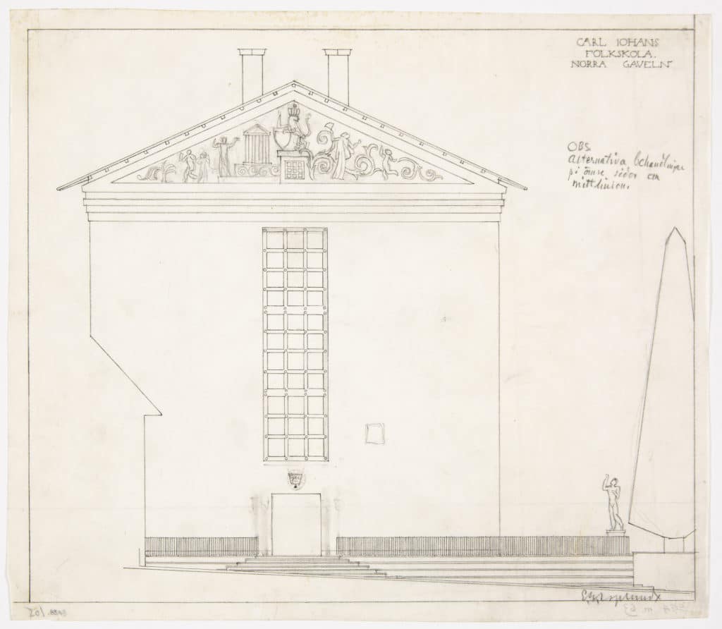
Asplund seems to reinvent the art of drawing with each new project, varying the weight and thickness of his line and the position of the image on the page to match the particular sense of every scheme. Here, as it reshapes the classically horizontal Attic temple into a vertical schoolhouse, Asplund’s pencil expresses the reductive classicism of the 1920s ‘return to order’ by harking back to the white space and delicate silhouettes of John Flaxman, or to the thin grey lines of those neoclassical steel engravings that fuelled the rage for antiquities and for such simplicity as Schinkel’s.
Asplund foregoes nearly all perspective, shadow, detail and texture, to describe his scheme through lines on a single plane, and suggests no surrounding context except the slight gradient that governs the podium.
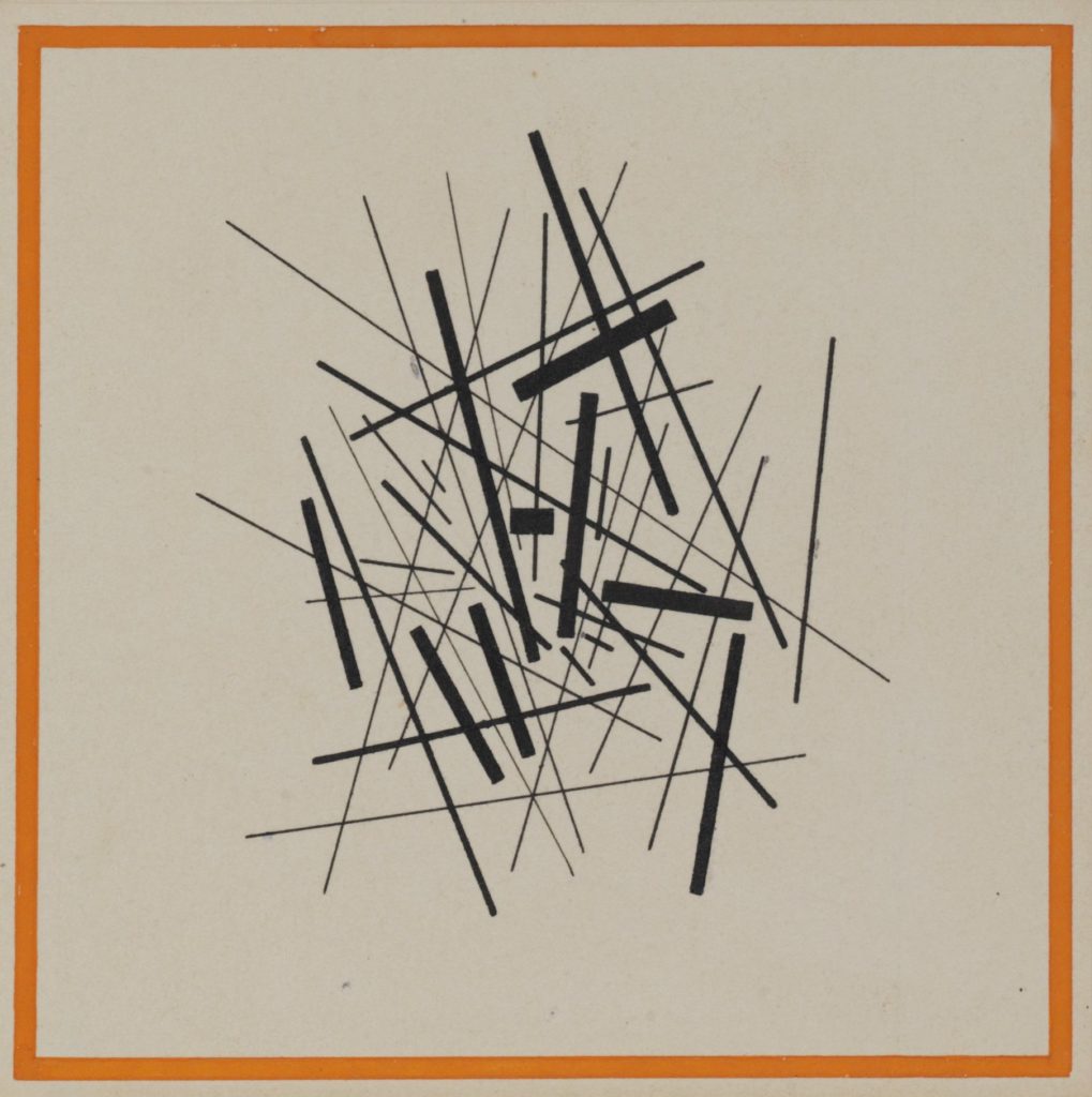
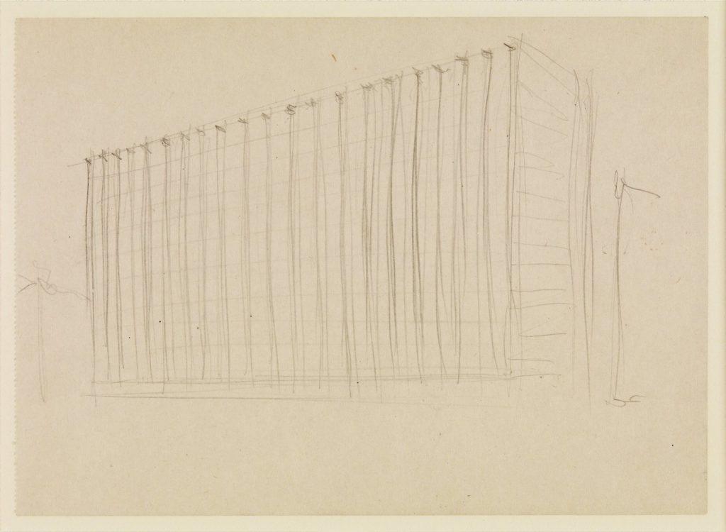
At about the same time, in a post-civil war Russia that was seeking a similar new sense of order, one of Iakov Chernikhov’s earliest studies in the ‘fundamentals of architecture’ proposed how shifts in the thickness and weight of line can be used to suggest perspective, structure and volume. ‘The line,’ he would say, ‘represents the absolutely dominating position in all representation of form.’ In this example, he uses lines to free architecture from the rectangle and perhaps the ground and propose a newly liberated dynamic order.
Some 30 years later, we see Mies telling us nearly everything about the transparency and composure of a projected high rise simply by softly tracing the lines of its mullions, and then pressing the pencil down to express the cross joints that anchor them to the roof.
Both the Asplund — a sharp-edged temple form, with no columns or pilasters — and the Mies — a skyscraper with no real weight or corners — are not just buildings represented by thin black lines and crossmarks, but buildings composed of them.
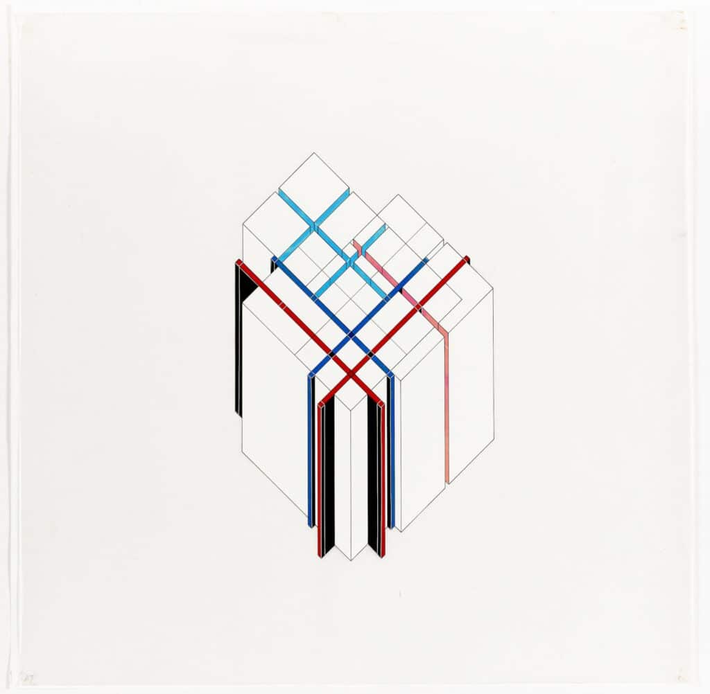
Compression: layering points of view
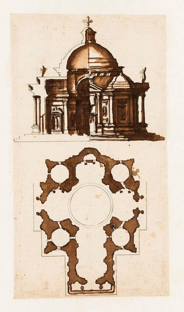
When the late Renaissance artist and architect Giovanni Battista Montano was commissioned to contribute a ‘paper museum’ of hypothetical buildings grounded in Roman models, the orthographic conventions that rendered three dimensions into two — plan, perspective, elevation, section — were just emerging.
In one example for a rotunda he simply collapses three of these into a single image, quarter portions of the whole serving perfectly well to conjure up all the features of a symmetrical project in its entirety.
Four hundred years later Aldo Rossi, in one of the memory drawings that formed a paper museum of his own, did much the same, compressing many different aspects of one project into a single sheet, from a perspective view of massing to the mapping of his site, and overlaying them with the same scrupulous regard to relationships of placement and scale.
By concentrating so much visual information within a single glance, both drawings invite a rapid mental leap from a dense kernel of lines squeezed into two dimensions on a tiny page to the comprehension of spaces and volumes unfolding on a large site.
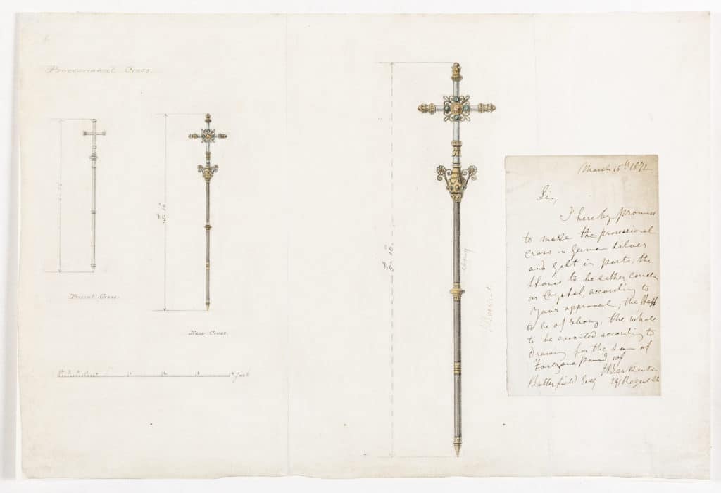
Something oddly similar happens to the fourth dimension – time and movement – in William Butterfield’s repeated images for a cross for All Saints’ Margaret Street. Butterfield lays out his proposal for a new cross to suggest its approach in procession, allowing us to gauge the stately movement of the crucifer up the nave by scaling our point of view so that we see its approach at different junctures.
Reduction: skeletons and skins
Perhaps the simplest way to look at building is to reduce it to its basic purpose of providing enclosure, and dwell on what Carlo Scarpa said were the only three things that matter: the sheltering skins of roof and wall, and the openings that make them habitable.
In schemes that fulfil three totally different functions in completely different settings – a gallery by Tatham for Thomas Hope in London, a bungalow in Madras, and a covered market in France by Chatillon – all the focus is on the surface of the wall, the shape of the roof, and the doorway.
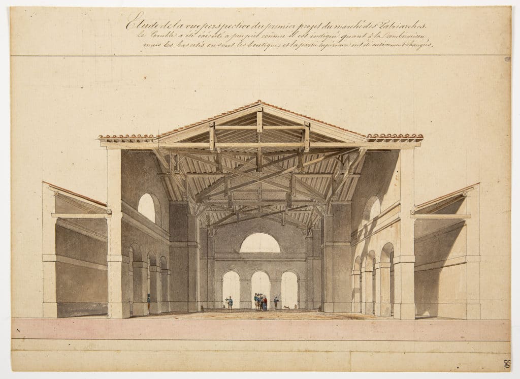
Nothing is quite so simple as empty space, nor quite so complicated to cover, which is what the elaborate beams and trusses of his roof allow Chatillon to imagine for the vast open span of his market shed. While the romantic qualities of the empty hall are gloriously suggestive, the precision with which colour, joinery and detail are presented in his roof make the technical rather than the atmospheric the real subject of the drawing.
In contrast, one of Edward Blore’s preparations for a published study of Gothic forms turns to the romantic language and landscapes of the grotto and the ruined abbey to analyse the organic origins of the vaulting and tracery which, like an avenue of great trees in a forest, supported the wide naves of the medieval cathedral.
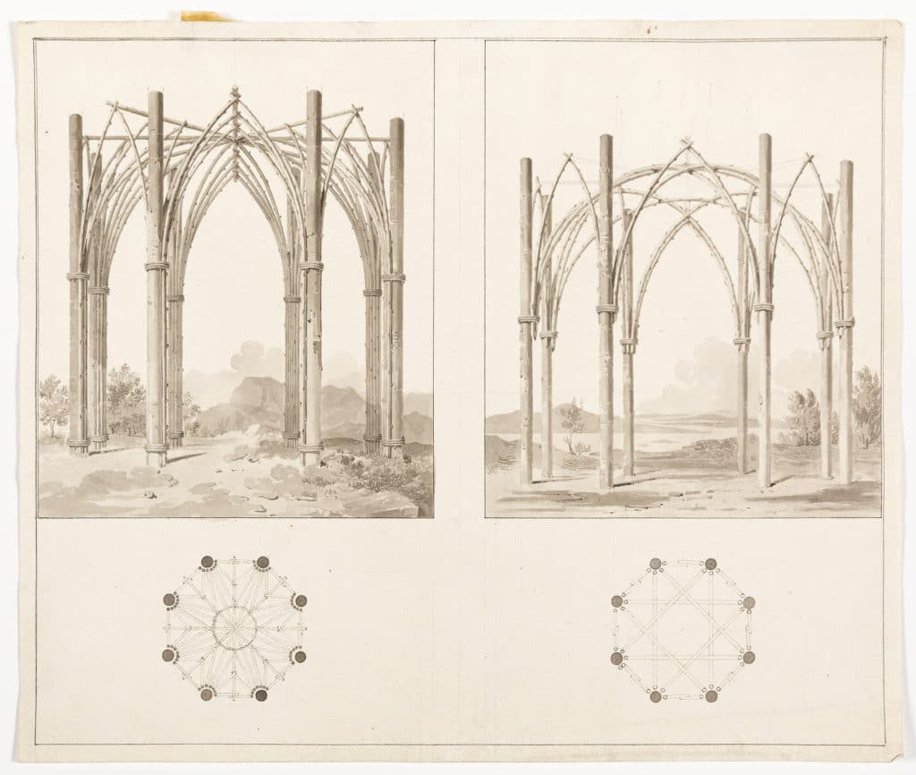
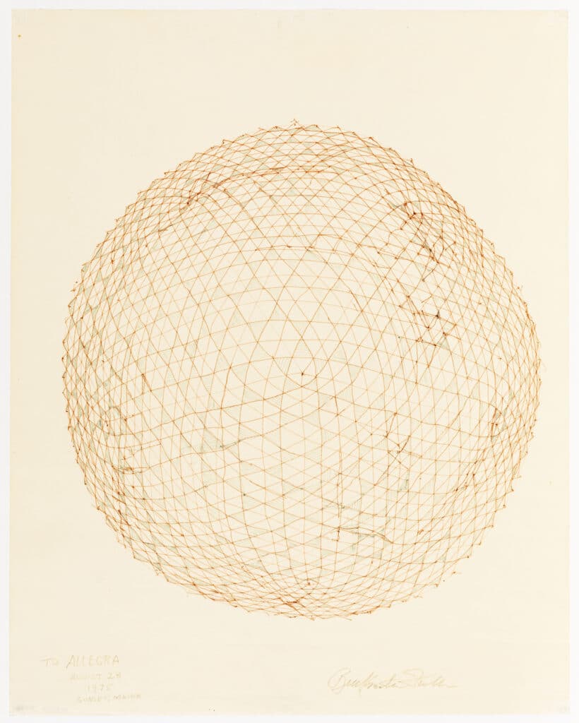
Blore’s anatomy is a skeletal geometry of the whole. For Buckminster Fuller (see over), the anatomical system involved in constructing the huge uninterrupted volumes of his domes requires the near-atomic breaking down of geometry into particles — the same form of reductive simplification into repeated identical modules that anchors the digital age.
Measures of man and nature
Fuller’s studies for spheres may look technical, but they were essentially a form of utopian analysis, derived as much from the search for the cosmic and universal that had marked his transcendentalist ancestry as from a quest for pragmatic solutions to problems in engineering large forms.
The same mix is found in Minozzi’s study for a spherical house for that ideal hero of the Revolutionary era, the ‘cosmopolitan’.
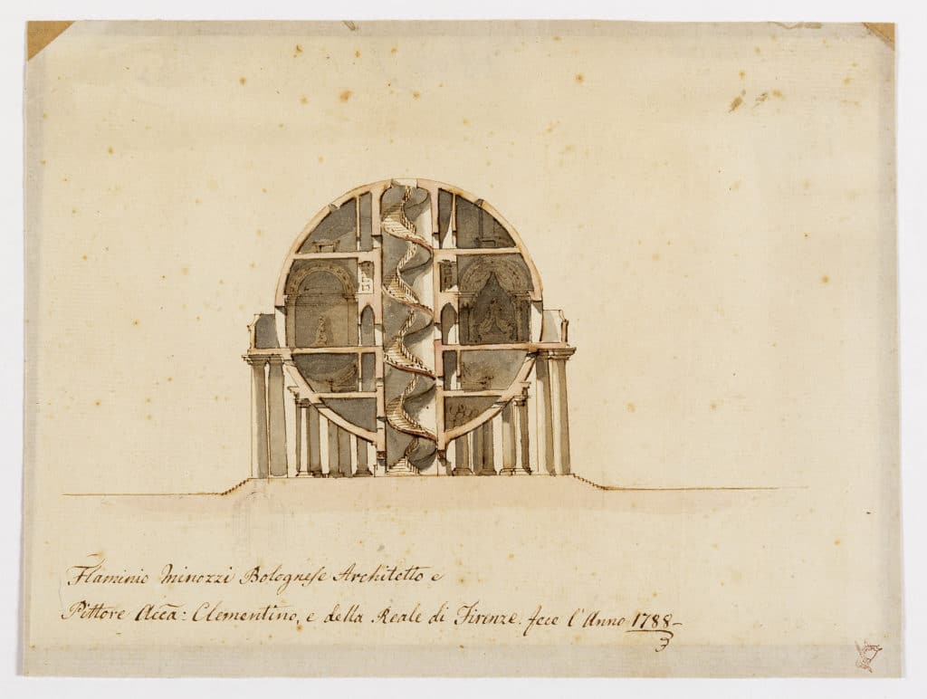
Engineered into an anatomic honeycomb of chambers, and like Boullee’s famous monument to Newton symbolic of the form of the earth, Minozzi’s sphere was to be filled with the artefacts of universal knowledge. We find a similar set of stacked chambers, geared to the same purpose, in Le Corbusier’s proposed museum of universal knowledge in Chandigarh, though the galleries are now linear and calibrated not to the music of the spheres but to the measure of man, dressed in the cosmopolitan uniform of his modulor.
What would have gone on in Herman Finsterlin’s expressionist and erotically charged ‘playhouse for an architect or artist’ can only be imagined.
But, sculpting shelter from a collage of biomorphic elements, like a totem in shell form, Finsterlin’s exercise is no less intent on cultivating a sort of fundamental earth knowledge.
Here the architect simplifies not by geometric reduction but in copying random and catenary forms of nature, fancying slightly unsettled sacs, membranes and organs which, like currently fashionable waves and blobs, carry a psychic fluency and sensual simplicity of their own.
It is to similar psychic echoes and their comprehension that all of Louis Kahn’s late work also tends.
But Kahn translates even Froebel’s fundamental kindergarten forms — from pyramid to sphere to column — into impregnably stable, masonic reminiscences of the archaic, which provide their own settings as they fall into the volumetric patterns cast by light and shade. In a drawing for a mural, he lays out the most ordinary elements of architecture along with the most monumental — the chamber and the door beside the pyramid — amid a desert of sunshine.
Here, in the simple shapes of building itself, are a new set of ‘orders’ in which architecture seems to have become simplified to the level of an abstract art and a form of universal knowledge in its own right.
Perhaps at times — and perhaps those have been its best of times — it is.

– Paul Mosley