Landscape Situations
Work on Paper, part I
– Niall Hobhouse and Nicholas Olsberg
Setting it out: making the landscape
For Horace Walpole, William Kent was born with a genius to strike out a great system from the twilight of imperfect essays.
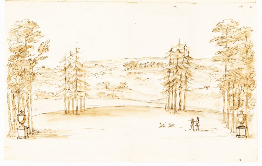
‘He leaped the fence, and saw that all nature was a garden.’ With apparent innocence, the sketch Landscape in Wimbledon proposes only a pair of classical urns and two clumps of (fast growing) conifers, but it makes explicit the whole of Kent’s ‘great system’ as a landscape gardener.
In 1738 his client, Thomas Walker, had bought Cannizaro House and 300 acres (120ha) on the southern edge of Richmond Park – a location valued for its proximity to the court of George II, and for the suggestion of nature untouched (but still a short horse ride from Mayfair). By framing the view from the first floor windows of the Palladian house, Kent casually appropriates for Walker the huge expanse of the park and Wimbledon Common, which then ran together. In the centre of the vista is Wimbledon House itself, just completed, and now the site of the All England Tennis Club (the Roehampton Lane housing blocks are to the far left).
Sarah, Duchess of Marlborough, had insisted that this be built – unconventionally, and to save herself the trouble of stairs – with no lower storey. It appears here, as a result, both as much further away from the duchess’s new neighbour than it really was, and as though sitting in an intriguing deep cleft in the landscape.
On the back of the sheet are what seem to be Walker’s and Kent’s calculation of the agricultural rents that would be lost to the landlord in the execution of the scheme.
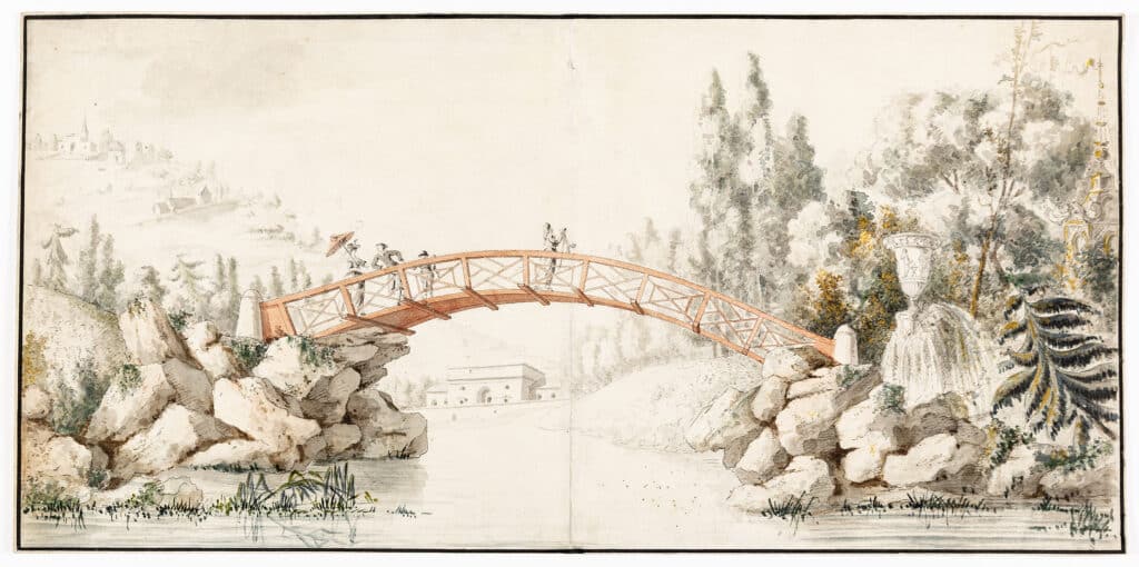
In this watercolour by an artist in François-Joseph Bélanger’s office, Kent’s two country gentlemen out walking their dogs are replaced with figures in oriental costume, making their way over a bridge towards a vaguely indicated pagoda.
We are being offered a circumscribed, and whimsically narrative, idea of the picturesque landscape, appropriate for the dying years of the ancien régime.
Bélanger had spent some time in England learning neo-classicism and his landscape skills; before starting work on the Bagatelle landscape in 1777, he had built the villa there in just 64 days out of a wager between the client the Comte d’Artois and his sister-in-law Marie Antoinette.
The curve of the bridge frames a distant view of another building, of wilfully indeterminate scale; given the size of the property, this can have been barely 200m beyond it. Neither structure may ever have been executed, or not in these forms, and the sheet may have served mostly to convey an idea of fanciful congestion to the comte. Certainly, the landscape had been changed many times, and was still incomplete when the French Revolution came. One has a sense, even in this project from the mid-1780s, that client and architect could have played on indefinitely.
Both artists are using drawing to suggest ways of extending the physical limits of their sites; both depend on creating very specific views into the landscape which appear nonetheless to be natural and spontaneous. Kent’s client could (almost) believe that he owned all he could see from his drawing room; Artois, by contrast, wanted as much as possible to be made to happen in the short walk around his suburban park.
In neither case is it easy to know how much we are seeing the landscape itself being bent by the designer, and how much by the way that he has chosen to represent it in the drawing.
Setting it down: placing the building on the ground
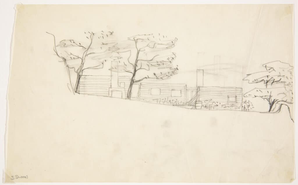
The Summer House at Stennäs that Erik Gunnar Asplund built for himself at the end of the thirties in the archipelago south of Stockholm produced one of his most remarkable sequences of development sketches.
Here, for once, was a site of his own choosing, in a place that he had known for many years and wanted to leave the better for what he did there. It is as though Asplund is here negotiating a contract between the landscape itself and the needs of his new family. He does this with great patience and courtesy; again and again one can see him consciously turning away from any sort of architectonic flourish. The house becomes his clearest statement about the responsibility of the architect to client and context.
The position of the house as a linear extension of the rocky shoulder to the north was first marked out with sticks by Asplund and the family, in a way that also minimised its impact from the sea. This very explicit compromise, which restricted the best views to the living room at the seaward end, remained unchanged throughout the design sequence.
The sketch below comes fairly early on, after Asplund has realised the sheltering advantage of this orientation for a small garden and for an outside hearth. What followed, step by step, was the understanding of the potential of a gabled roof as a device for creating head height in the bedrooms and sloping ceilings, the decision to compress the mass into only two volumes, the elimination of the transverse glazed links (that had survived as a reference to traditional farmhouse structures), and the offsetting of the living room block from the larger range to provide further shelter for the garden and exploit the junction of the different gable angles.
Only at the end comes the celebrated 8 degree rotation of the smaller volume – to get the most out of the views, of the fireplace ‘knuckle’ between the two structures, and the interior promenade. Each step has the deliberation of a chess move. The movement is always away from superfluous references to the topical architectural discourse; as the house is drawn slowly onto the landscape, we observe just a simple dialogue between place and architect.
Among great 20th century architects none treated the site as quite so much a matter of duty as Richard Neutra. His pre-war projects for domestic architecture had been in large part about building the Los Angeles slope.
The commission that came in the late forties to build a sanatorium, Sanatorio Universitario Italiano, on the slopes above Lake Maggiore was an opportunity to tackle these questions at institutional scale. In this case, long horizontal slab blocks were required by the brief.
Neutra’s commentary on the project tells us that ‘at Machu Picchu the early Peruvian builders terraced the sloping saddle between two fantastic peaks in full awareness of the beauty of the situation, though what is ‘esthetic’ to us was to them a ritual and religious connotation.
And at SUI, full views into the lovely landscape were planned deliberately to serve the inhabitants – tubercular patients more anchored to site than other human beings – as an element indispensable to living’.
This quote is from Mystery and Realities of the Site, a slim black and white bible for American architects in the fifties; one should note the studied use of ‘esthetic’, as a word within inverted commas. Never has the careful logic of functionalism, as expressed by an architect in print about his own work, been so happily contradicted by the inventiveness and vivid colour of his drawings of the same subject. To be fair, it is exactly this opposition between theory and invention that allows Neutra his high spirits as a draughtsman.
Testing situations: buildings that order nature
Two drawings produced in Paris at the middle of the 18th century and possibly no more than 15 years apart, each make the argument for a certain approach to architecture, but from opposite sides of a deep ideological divide.
Gilles-Marie Oppenord was a great northern interpreter of the Roman baroque, and among the boldest designers of rococo ornament in France. He was the son of a cabinetmaker, was recognised early as a fine draughtsman, and became chief architect to the Regent, the Duc d’Orleans. He worked in a world in which building, decoration, furniture design, painting and drawing had not yet been narrowly differentiated or fully professionalised.
A Capriccio Landscape is a very large drawing, of unspecific (or at least unspecified) purpose. It has the air of a manifesto and it may belong to the last years of Oppenord’s life when there was less work (he had acquired a reputation for structures that were ambitious and, too often, unstable). It is just possibly the cri-de-coeur of an architect who knows that his moment has passed.
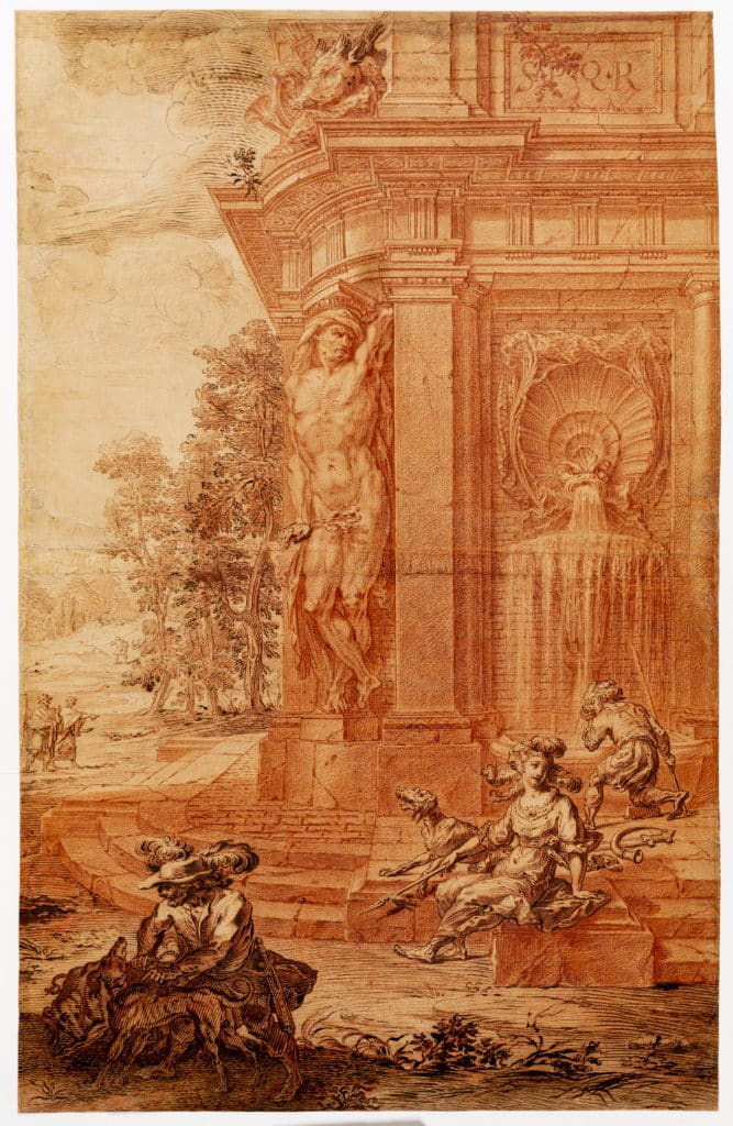
We are shown the lower portion of a monumental fountain, carefully identified as from ancient Rome, partly ruined but still gushing water. Vastly over scale, decorated by hunting trophies and supported at the corner by an immense naked caryatid, it stands in an untouched Virgilian landscape populated by dogs, huntresses, huntsmen and other figures, in contemporary and in ‘classical’ dress. Each of these narrative clues works to remove the subject matter further from any specific idea of time or place. The multiple techniques used in the drawing flow over their subject matter, without any regard for what they are representing but intent on generating the greatest effect of depth and light. Oppenord is showing off, to all comers, in the medium he understands best.
Abbé Marc-Antoine Laugier was not an architect but a historian and a polemicist, who eventually found the Jesuit order too constrained for a successful man of letters; he became a Benedictine after the publication of the Essai. The engraver produced Frontispiece for An Essay on Architecture (right), under direction from the author, for the second edition of what proved to be the first truly popular work of architectural theory (published anonymously in 1753, the text was all over Europe within three years). This was the only illustration, and the image has survived in some form in all subsequent editions and translations.
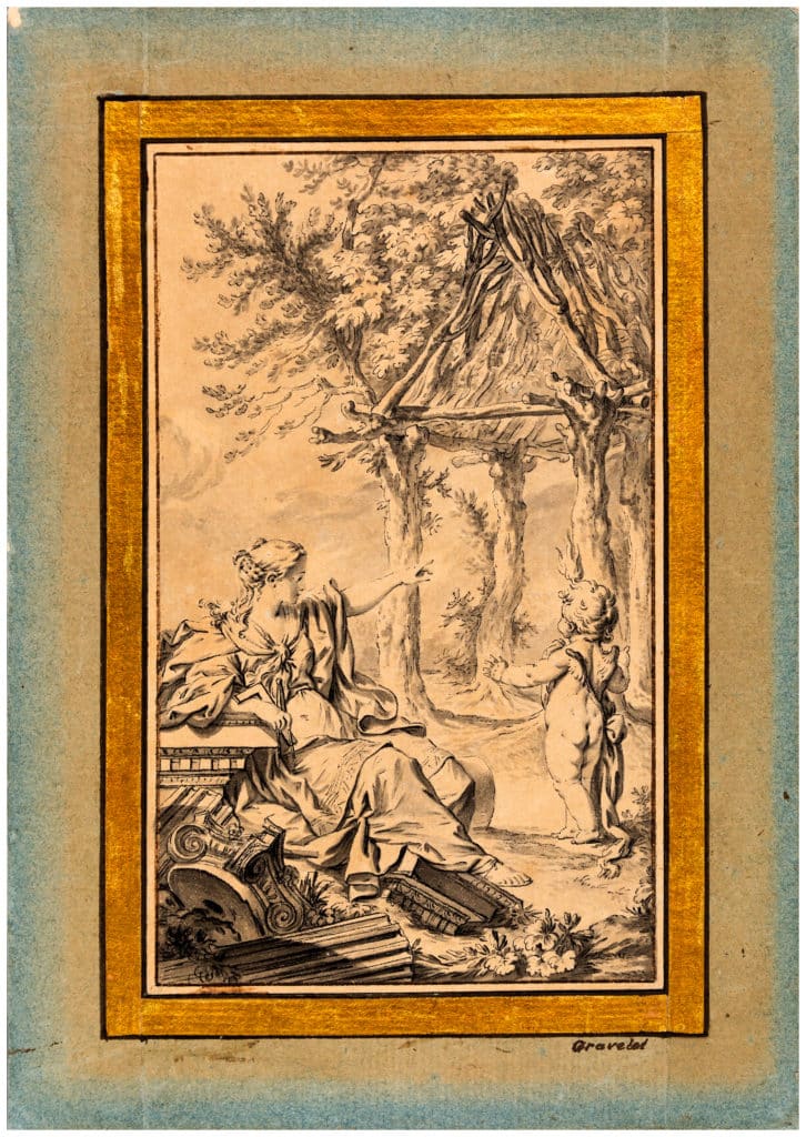
Laugier offered to take architecture back to its simplest structural principles: the column (post), the entablature (beam) and the pediment (which derived from the roof of this basic structure). As an idea, the primitive hut had been around since Vitruvius, but this was the earliest statement of the modernist principle that something might look good because it was good. Laugier’s text proved timely and powerful for the theoretical discourse, providing an elegant rationale for neo-classical architecture; it was much quoted by Soane in his Royal Academy lectures, and was energetically reworked by Le Corbusier.
What the drawing shows us is the figure of Architecture, reclining (as comfortably as she can) on fragments of Greek columns and cornices, and indicating to an amazed putto the first principles of architectural construction. But it is hard not to see here, as well as this innocent spectacle, a strong echo of countless printed images of the Temptation – as though Laugier’s somewhat casual invention of rationalism was also the germ by which architecture lost its innocence.
By becoming conscious of itself, as it did above all in this small engraving, architecture was required to wrestle with a vast new range of theoretical problems. What began just as a narrow, mid-century, attack on the engaged column (as against the free-standing one) became inexorably an ideological discussion that could not be carried on without wholly new ideas about history, context, landscape or the vernacular. Among other things, Laugier had invented the profession.
We could not be further removed from Oppenord’s exuberantly expressed belief in a practice of architecture that is indistinguishable from drawing. In the context of this article, it may just be possible to see – in the way that each of the two buildings rests in their idyllic landscape – the opening of the theoretical gap between something drawn and something designed.
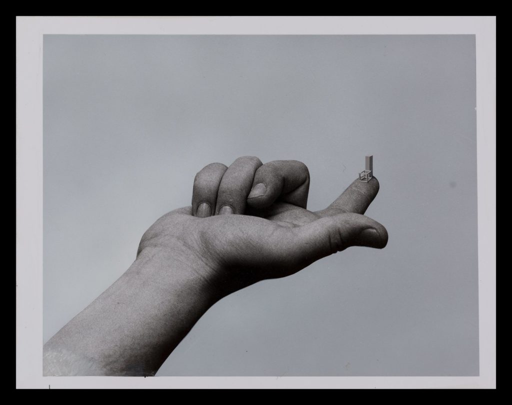
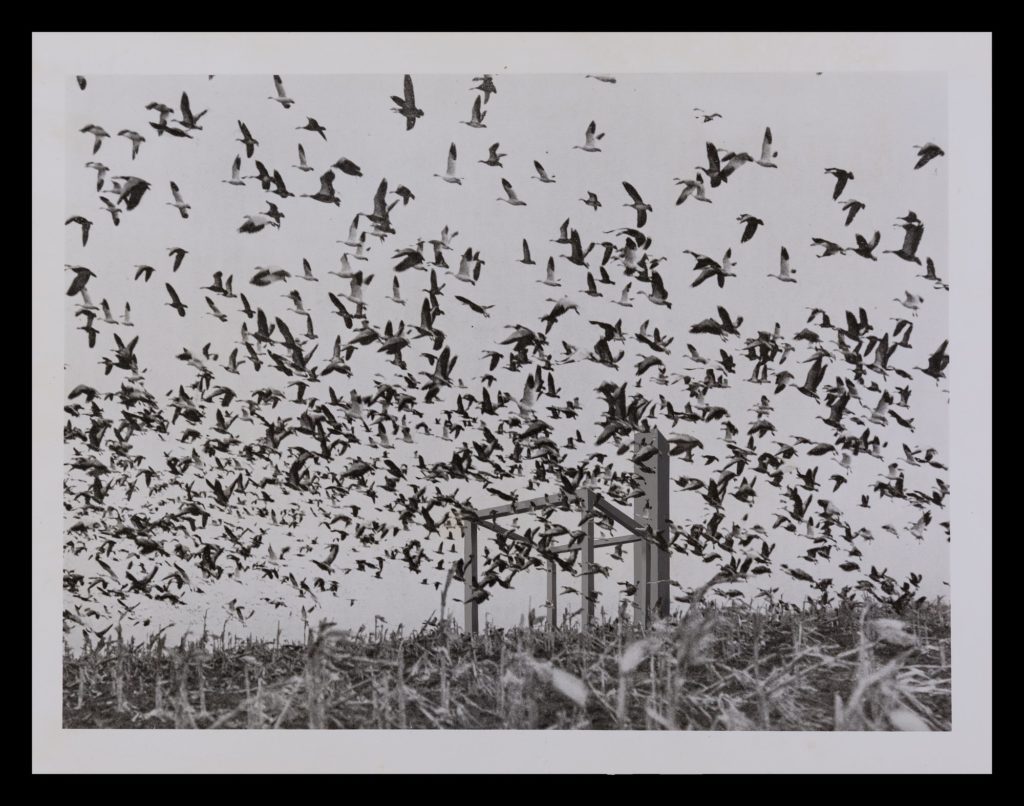
The cover for AD for May 1971 included two images from Derek Boshier’s installation 16 Situations (below), then on view at the Whitworth Art Gallery. Here we see the primitive hut again – this time in the hands of a 20th century artist.
16 Situations is part sculpture, part conceptual art, and consists of 16 framed ‘photographic images’ and a small Perspex sculpture in two elements.
Crowning nature: buildings that command their site
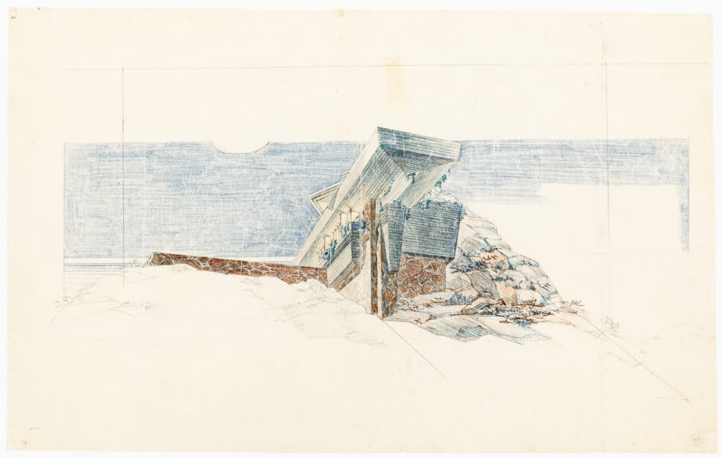
The movie mogul Arch Oboler had bought 120 acres (48ha) in California’s Santa Monica mountains, overlooking the Pacific, and originally planned an extensive complex including stabling and film processing facilities. Had it been completed, Eaglefeather would have been a spectacular finish to Frank Lloyd Wright’s work of the thirties that had included both Fallingwater and the Sturges House.
All three projects make dramatic play of imposing bold horizontal structures onto very steep terrain; Wright was by then very clear that in such projects, by crowning the landscape with a building, he aimed to complete the work of nature. A particular characteristic of this large sheet (top left), on which Wright is working with Allen Lape Davison, is the angle at which the house projects towards the viewer; our sense of the steepness of the hillside derives largely from this implied tilt of the picture-plane (the drawing is at its most effective when viewed lying on a horizontal surface).
Wright and Davison (whose skill at night-time renderings was valued at Taliesin) are making a lovely exploration of how the house might dress itself best in the light of southern California. The final presentation perspective, which Wright approved in August 1940, shows the structure in the same perspective and rendering, but with the sun higher in the sky and no longer behind the building; the much warmer palette contrasts with the early morning blues of this drawing, and much more information has been added about the slope and the vegetation, so that the overall effect is less stark and angular, and the building is no longer anchored precariously just to its rocky outcrop. In this version, however, the primary setting is simply the light itself.

– Niall Hobhouse and Nicholas Olsberg