Architects are extraordinarily reluctant to incorporate into their visual descriptions of buildings any evidence that the real subject their structures serve, and around whose activities they are so carefully formulated, is people. Here’s a look at a few of the moments when this unspoken rule has been broken.
Distances: Using human figures to show scale
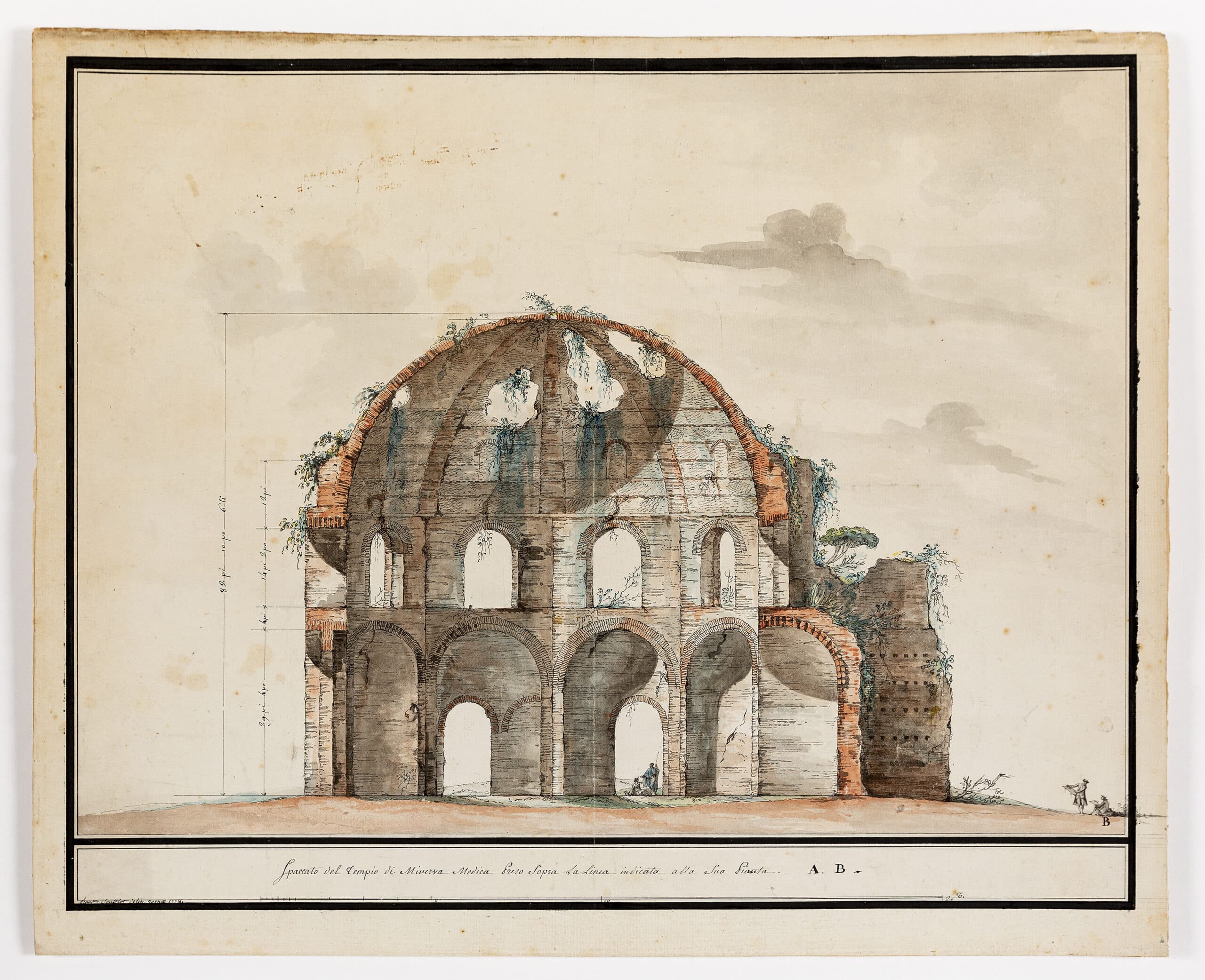
Artists have been inserting shepherdess and swain into views of ruins for a very long time. It is a particularly crisp way to suggest the fate of civilizations, showing how nothing useful may remain of the great stone landscapes of ‘eternal cities’ save the odd sheltering landmark for the timeless task of guarding sheep. This was a convention that seems to have greatly appealed to travellers on the Grand Tour, colouring the scene with the picturesque, registering the scale of the monument at hand, and hinting gently at memento mori. François Soufflot, the young nephew of the great Jacques-Germain Soufflot, takes particular delight in the contrast between the evident excitement of the dilettanti of 1778 as they draw and measure the Temple of Minerva and the statuesque repose of the Roman rustics using it for shade.
Quite a different use of the georgic appears in a 1785 proposal to move the medieval Hôtel-Dieu out of central Paris. Bernard Poyet places his new structure on the Île des Cygnes, a stretch of timberland and pasture then in the first stages of being linked to the Left Bank through depositing waste.
In Poyet’s day it was a famous site for rural promenades (Rousseau being among its habitués) and for the official burning of offal; in our century, it houses Jean Nouvel’s Musée du Quai Branly. The architect shows a view from the Champ de Mars toward the point where ancient woodland and new infill converge, with the hospital firmly on that boundary.
Trees, human figures and animals are all diminished and drawn with sharp shadows to heighten perspective and exaggerate the scale, luminosity and near medieval austerity of the architecture (which casts hardly a shadow at all). The quietude of the scene is clearly lodged in a tradition of landscape caprices and pastorals going back to Claude — with the only hint of movement that of a shrouded invalid being carried to the hospital on a stretcher.
Like so many Enlightenment tales these studies inflect the tragic with the wry. Death and good humour live side by side, the serious business of recording a monument with mockery of those who go about it. They also use the human figure to talk to some quite solemn sense of distances — between one time and another, pastoral knowledge and learning, city and country, sickness and health. And Poyet’s project gives a very early hint of the modern idea that one can better convalesce, or expire if need be, amid a peaceful landscape.
They also speak to the custom of the century between about 1750 and 1850 when human habitation of the architectural drawing was in fashion. As we shall see, there were good polemical reasons for this custom, as there were in the rarer instances where modern architects revived the practice of peopling their presentations. In many of these another kind of distancing much in tune with its time comes into play — that of the faceless crowd.
Unlike the flimsily over-scaled monumentalism of most world fairs, Erik Gunnar Asplund’s designs for the 1930 Stockholm Exhibition answered the economic constraints of the time by focusing — as the Festival of Britain would do in a similar social climate — on genuinely transitory structures. It was a rigorously edited and modernised version of the seaside bathhouse, pier and promenade: lightweight monochrome pavilions brought to architectural life by the decoration of everything around them, from seating to banners and signs. Yet the figures he adds belie the apparent generosity of the scheme. They are as colourless, uniform, solitary and inert as the poles that carry his waving flags: a view of one of the vividly ornamented cafés shows almost every diner in black and white, apart, and from behind.
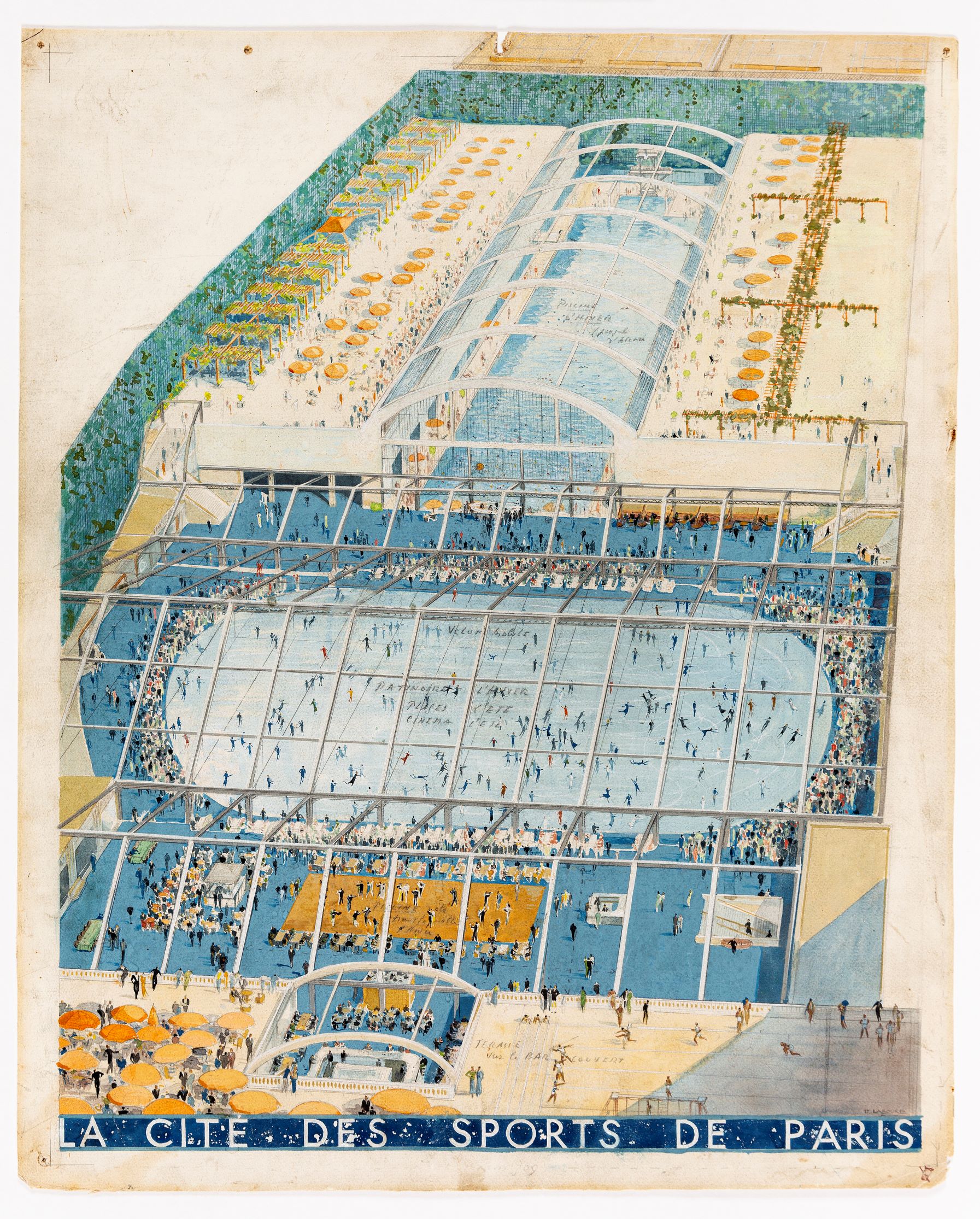
About the same time, the birds-eye view of a huge covered swimming pool design for Paris reduces its swimmers to antlike figures on the ground. Twenty years further into the evolution of mass society, Rene Herbst (working with Sophie Warburg) draws on the fundamental shapes of cylinder, cone, and cube and on primary colours to organise an exposition celebrating rayon. This clearly speaks not just to the shapes and palette of the nursery but to the microscopic structure of the synthetic fibre itself, so that the Lilliputian figures he shows do not simply lend emphasis to the scale of the pavilions but are even further diminished by being such tiny creatures amidst towering elements that represent a microscopic world.
Frank Lloyd Wright uses the same Einsteinian proportions for the figures that give scale to the rendering of a sports centre in Los Angeles.
In similar dialogue with vastly blown-up geometries of the atom and the crystal, tiny torsos struggle to crest the sweeping lines of its parapets. Little stick figures — one might represent a million — were of course a commonplace of midcentury social and statistical graphics.
But one wonders, as we look at these extreme examples of a reductive approach to staffage, if the exaggerated anonymity and smallness of these dark figures are there not just to heighten the vividness and scale of their surroundings but, by being shown without any marks of type or trade or standing in society, to underline the universality of the projects’ social agendas.
Conversations: Depicting human drama
Nothing could be further from this neutral notion of staffage than the hyperactive street scene with which Paolo Posi records his design for a temporary structure for the papal festival of the Chinea. Yet, as the architect gives the open space of the city over to a catalogue of its leading street types (vicious canines not excluded), the same universal moral — that the celebration is for the delight of all society — is surely to be drawn.
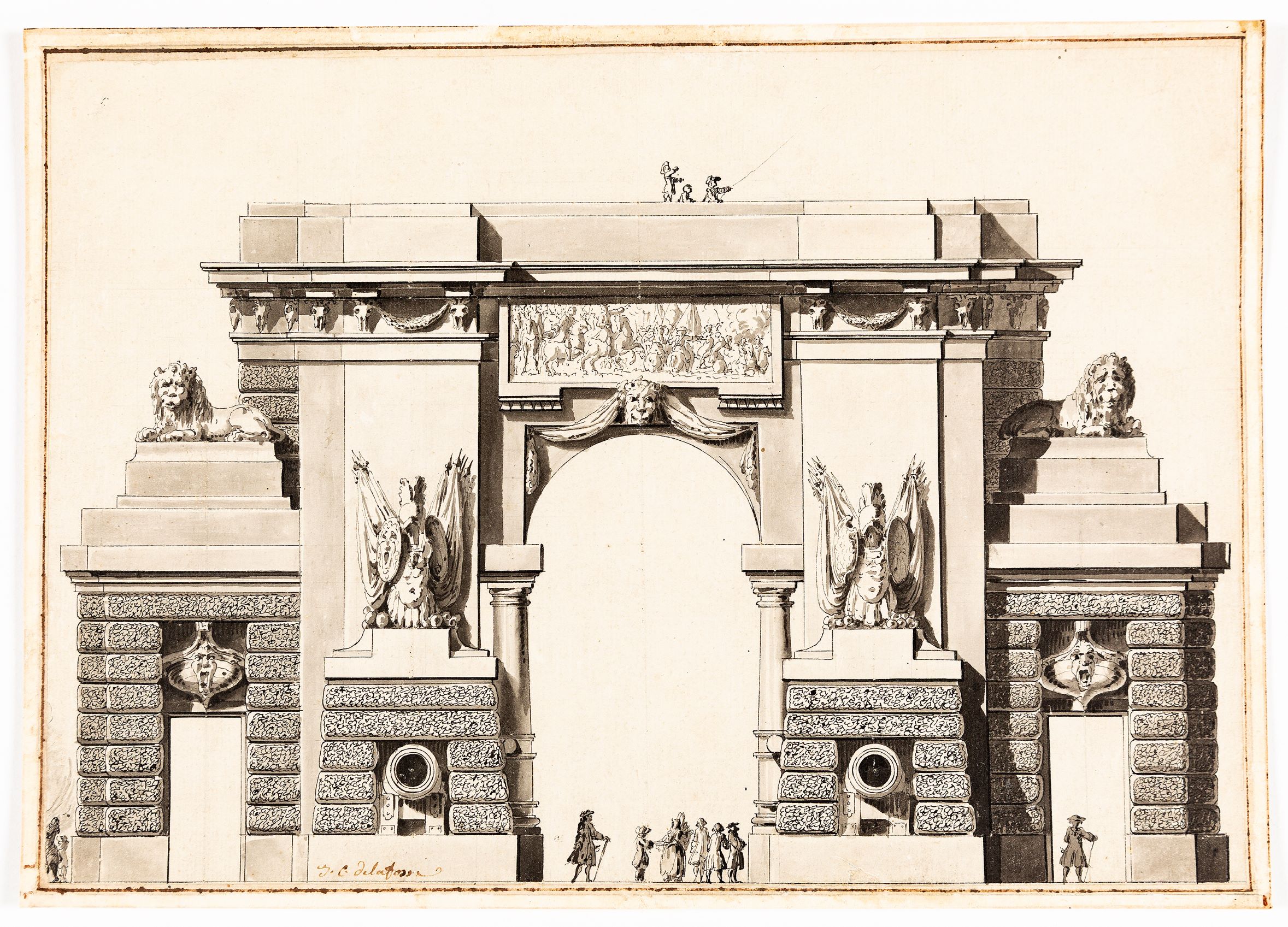
There is much whimsy here: the pomp of the pavilion undermined by the way in which the human figures, one a swooning lover, mock the lounging postures of their sculpted companions. There is even more — including some mockery of the architect’s own pretension — in the way Jean-Charles Delafosse shows a proposed triumphal entry to an admiralty wharf. Both the grandiloquence of the scheme and the overweening dignity of the proud functionaries who come to admire it (the dandyish architect and his boorish clients perhaps) are equally teased by the presence of two lads who recognise the great monument only as a way to get high enough for their kite to catch the ocean breeze.
Bélanger’s 1779 presentation of a projected theatre for the Comédie Italienne shows another idea of the great social conversation. At first glance this seems to portray an impossibly overcrowded, manically animated scene until one remembers for how long the theatre was the only well-lit social space in a city after dark with any pretence of safety (there are guards with muskets in almost every corner of Bélanger’s scene). Witnesses from Samuel Pepys in Stuart London to Walt Whitman in 1850s New York talk of being there almost nightly. Here we see everything, including the courting of an actress, that went on in these complicated surroundings. Bélanger delights in showing the humans mimicking the demeanour of the statuary nearby (or are the statues mocking the humans?).
From a practical point of view this shows the particular usefulness of staffage in demonstrating the scale of ornament, clearly a simpler task when live figures could be placed against those in decoration. But there is more to it. Placing the gesturing statuary amid the living pulcinellas and columbines of the staged drama and having them all in some way mingle with the social theatre of their audience and its servants, Bélanger makes a broader Italian comedy of his own.
All these invented dramas help us see how the ornamental and spatial programmes of an eighteenth century building served — like the plays performed within them, the avenues on a philosopher’s walk or the cabinets of a grand salon, as the scenes, objects and pathways that stimulated the discourse they were intended to produce, and by those means ensured the civil amity and progress of the entire society the buildings furnished.
In their presentation of new schools, two of the great social architects of the twentieth century use a similarly careful choreography of figure to make the same point: that the construction of a sympathetic social space can construct a sympathetic society. At the first of his experimental schools in Los Angeles, Richard Neutra opened up the classroom as a space of exploration, based on play rather than instruction, in which children would form adhoc working groups as they moved between or invented activities.
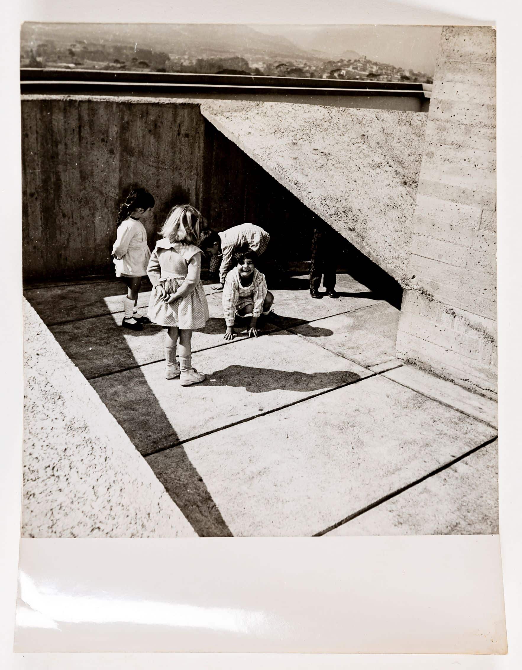
Like Giuseppe Terragni in his Asilo Sant’Elia, in Como, which probably borrowed from it, Neutra introduced a radically different sense of undiminished scale and of the widest access to the light and to out of doors so that the entire scheme – as the questing child in the foreground suggests – moved toward discovering rather than learning natural and social truths. An astonishing sheet of sketches and notes shows how Le Corbusier and his photographer constructed views of the children on the rooftop nursery school of the first Unité d’Habitation, to much the same purpose of demonstrating how to make a space of social and intellectual adventure by loosening the ways in which it determined grouping, activity and confinement.
Neutra’s site of discovery was the open room and garden; Le Corbusier’s the secret caves and corners of his walls, with the wilderness of the garrigue just visible beyond.
Both are experiments in delivering the new promise that by replacing the old pedagogy with independent exploration and uninhibited social relations we would not only raise happier children but inspire great leaps forward in the scientific imagination and the construction of community.
Moods: Building an atmosphere
Antti Lovag described himself as an ‘habitologue’, a student of the unconscious patterns and drift of human movement and gesture. He built for adults, as Neutra and Corb did for children, spaces in which they could move their discoveries of self between the spatial, the social and the contemplative.
Lovag’s model for a ‘space of meditation and conviviality’ proposes a honeycomb of vaulted chambers contoured to his perception of the body and its movements, the scale and curve of the arches corresponding to the sweep of the human arm. While the result looks much like the inflatable buildings and bubble shelters that intrigued the technological avant-garde of the sixties, Lovag’s linked chambers have very different origins, in psychoanalytic thinking and in the contemplation of nature forms, and their purpose and sensibility is much closer to the expressionists of the twenties, to Frederick Kiesler’s Endless House, and to the fascination of surrealists for the regenerative spaces of cave, shell and womb. Neither shadow nor substance, not quite together and not quite apart, the wanderers in these cloisters echo precisely the play between singular and collective, together and apart, accident and purpose, that governs the pattern and the inkblot plan of the chambers they inhabit.
One gets a similar feeling of uncertainty about the figures used to render Ludwig Mies van der Rohe’s proposal to redesign the interior of Karl Friedrich Schinkel’s Neue Wache in Berlin as a memorial for the war dead, a monument that talks of loss through its own extraordinary emptiness. Recognising a vacancy that would be impossible to read without the vertical mourning figures that dominate it, Mies turned to an artist to portray the space, for one of the most obvious reasons for architects’ inhibitions about staffage has been the great difficulty so many find – as measurers and masters of straight line – in representing the figure.
Both projects are mood chambers, and a human presence seems vital to their representation. We see similarly moody and theatrical staffage used to evoke scale in drawings for historic sites as nineteenth century architects proposed their restorations.
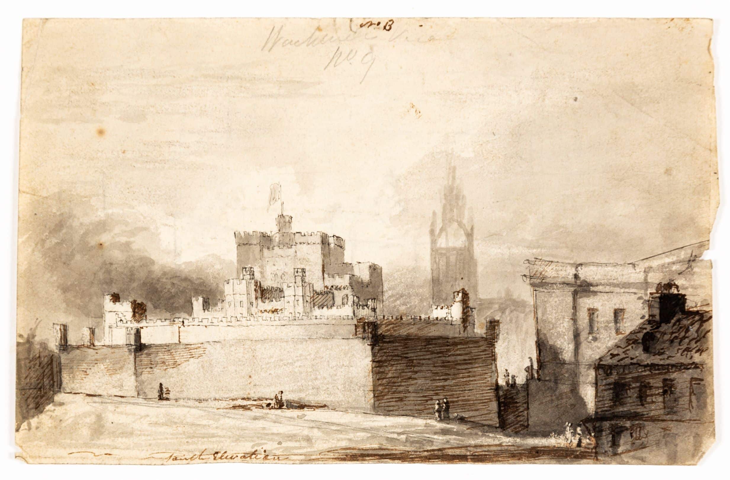
We can see this in the darkly medieval, slightly melancholy temper that infects a drawing by Robert Smirke for the battlements of the Tower of London, done about 1819 and apparently allied to his work on the Royal Mint. Tiny slightly rustic figures suggest the timeless characters who trudged this boundary of the city since the great keep was built: a gloomier and quite un-sunlit version of Soufflot’s pastorale.
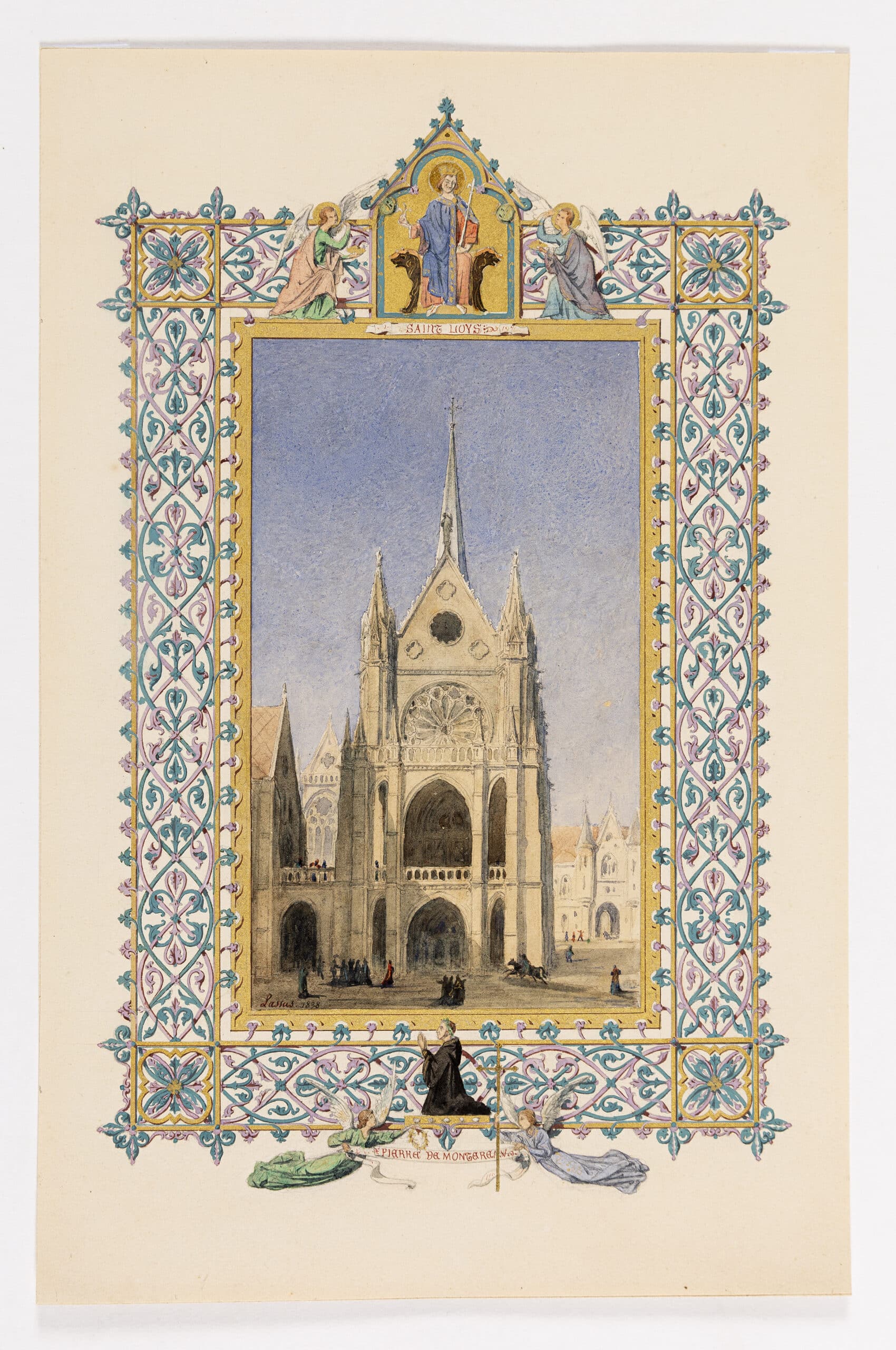
Jean-Baptiste Lassus shows his restoration of Sainte Chapelle in Paris as it neared completion in 1838 with a medieval monk in its illuminated border and a prancing horseman in its centre, evoking the length and variety of histories and the markedly different moods that infect the environs of a sacred space. Dark-robed figures process solemnly across the foreground while a scarlet jester dances, arms akimbo, under a distant arch of the royal archives. Framing these new sites as distanced vistas, inhabiting them with figures and atmosphere that seem to move back in time, the architects lend a persuasive air of truth to history in what were really drastic interventions in the ancient fabric.
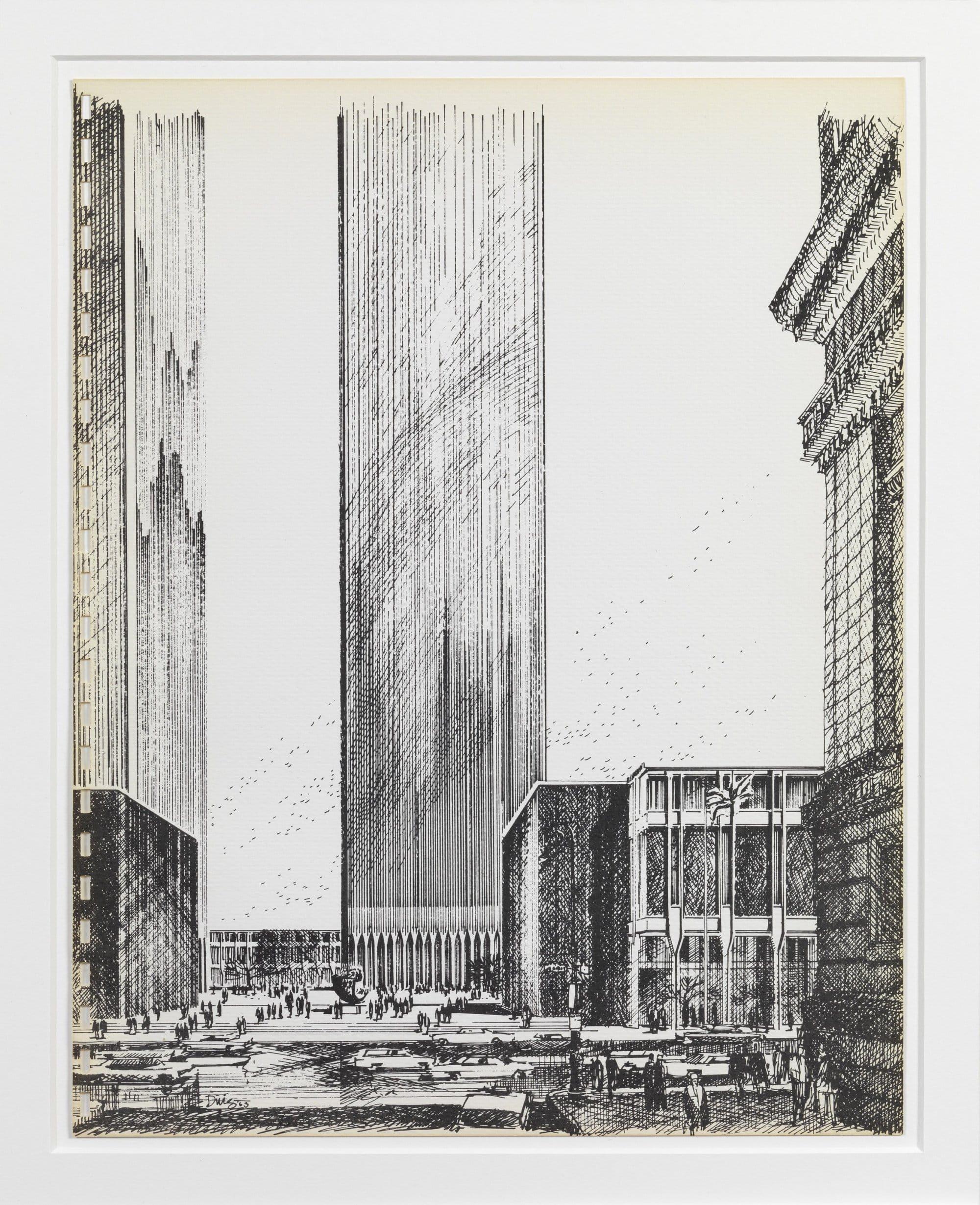
There was an era, not so long past, in which our once overcrowded cities seem to have become enchanted by the calming aesthetic and eloquent silences of the monumental void, like the barely raised platform fronting Mies’s Seagram building or the masonry deserts that framed Boston’s and Toronto’s city halls. Commissioned in 1963 to make prints to advance (and articulate) Minoru Yamasaki’s World Trade Centre, then in its first design stage, the great delineator Carlos Diniz is determined to draw its barren plaza as a site of ideal encounter and activity.
Here the introduction of staffage plays both a commercial and a polemical role, celebrating both the busyness that developers demanded of a site, and the then prevalent ideal of a universe made safe through commerce and ‘small world’ international friendship. In his efforts to sell commercial projects to tenants and financiers Diniz would go on to crowd his perspective presentations for the pioneer urban playlands of the Rouse Company with such extreme degrees of animation and so wide a variety of human types that the staffage of Posi and Bélanger is rendered almost static by comparison.
His inventive delineations of new metropolitan spaces, drawing admiringly on Gordon Cullen’s models, would do much to move the shift in perceptions of the city toward a new urbanism, in which the ‘congestion’ of the fifties became the ‘density’ of our time.
It may seem odd that a gargantuan project like the twin towers, critically damned from the start as soullessly bland and scornful of context, should have served its delineator as the battleground for one of the first great salvos in the fight to repopulate the empty space of the metropolis. Oddly touching too, because we now remember these rather boring towers very much as Diniz’s mind’s eye foresaw them.
We now recall the same lovely liquid sleekness with which he lit their surfaces and upon which his admiring foreground figures gaze, and we memorialised the thousands lost there one bright September morning in much the same vein as his staffage – as a rich and lively panoply of busy peoples.
Displaced persons
Work on Paper, part IV
– Niall Hobhouse and Nicholas Olsberg
Architects are extraordinarily reluctant to incorporate into their visual descriptions of buildings any evidence that the real subject their structures serve, and around whose activities they are so carefully formulated, is people. Here’s a look at a few of the moments when this unspoken rule has been broken.
Distances: Using human figures to show scale
Artists have been inserting shepherdess and swain into views of ruins for a very long time. It is a particularly crisp way to suggest the fate of civilizations, showing how nothing useful may remain of the great stone landscapes of ‘eternal cities’ save the odd sheltering landmark for the timeless task of guarding sheep. This was a convention that seems to have greatly appealed to travellers on the Grand Tour, colouring the scene with the picturesque, registering the scale of the monument at hand, and hinting gently at memento mori. François Soufflot, the young nephew of the great Jacques-Germain Soufflot, takes particular delight in the contrast between the evident excitement of the dilettanti of 1778 as they draw and measure the Temple of Minerva and the statuesque repose of the Roman rustics using it for shade.
Quite a different use of the georgic appears in a 1785 proposal to move the medieval Hôtel-Dieu out of central Paris. Bernard Poyet places his new structure on the Île des Cygnes, a stretch of timberland and pasture then in the first stages of being linked to the Left Bank through depositing waste.
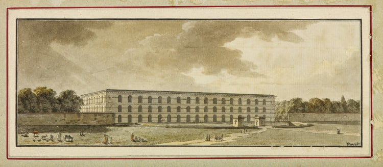
In Poyet’s day it was a famous site for rural promenades (Rousseau being among its habitués) and for the official burning of offal; in our century, it houses Jean Nouvel’s Musée du Quai Branly. The architect shows a view from the Champ de Mars toward the point where ancient woodland and new infill converge, with the hospital firmly on that boundary.
Trees, human figures and animals are all diminished and drawn with sharp shadows to heighten perspective and exaggerate the scale, luminosity and near medieval austerity of the architecture (which casts hardly a shadow at all). The quietude of the scene is clearly lodged in a tradition of landscape caprices and pastorals going back to Claude — with the only hint of movement that of a shrouded invalid being carried to the hospital on a stretcher.
Like so many Enlightenment tales these studies inflect the tragic with the wry. Death and good humour live side by side, the serious business of recording a monument with mockery of those who go about it. They also use the human figure to talk to some quite solemn sense of distances — between one time and another, pastoral knowledge and learning, city and country, sickness and health. And Poyet’s project gives a very early hint of the modern idea that one can better convalesce, or expire if need be, amid a peaceful landscape.
They also speak to the custom of the century between about 1750 and 1850 when human habitation of the architectural drawing was in fashion. As we shall see, there were good polemical reasons for this custom, as there were in the rarer instances where modern architects revived the practice of peopling their presentations. In many of these another kind of distancing much in tune with its time comes into play — that of the faceless crowd.
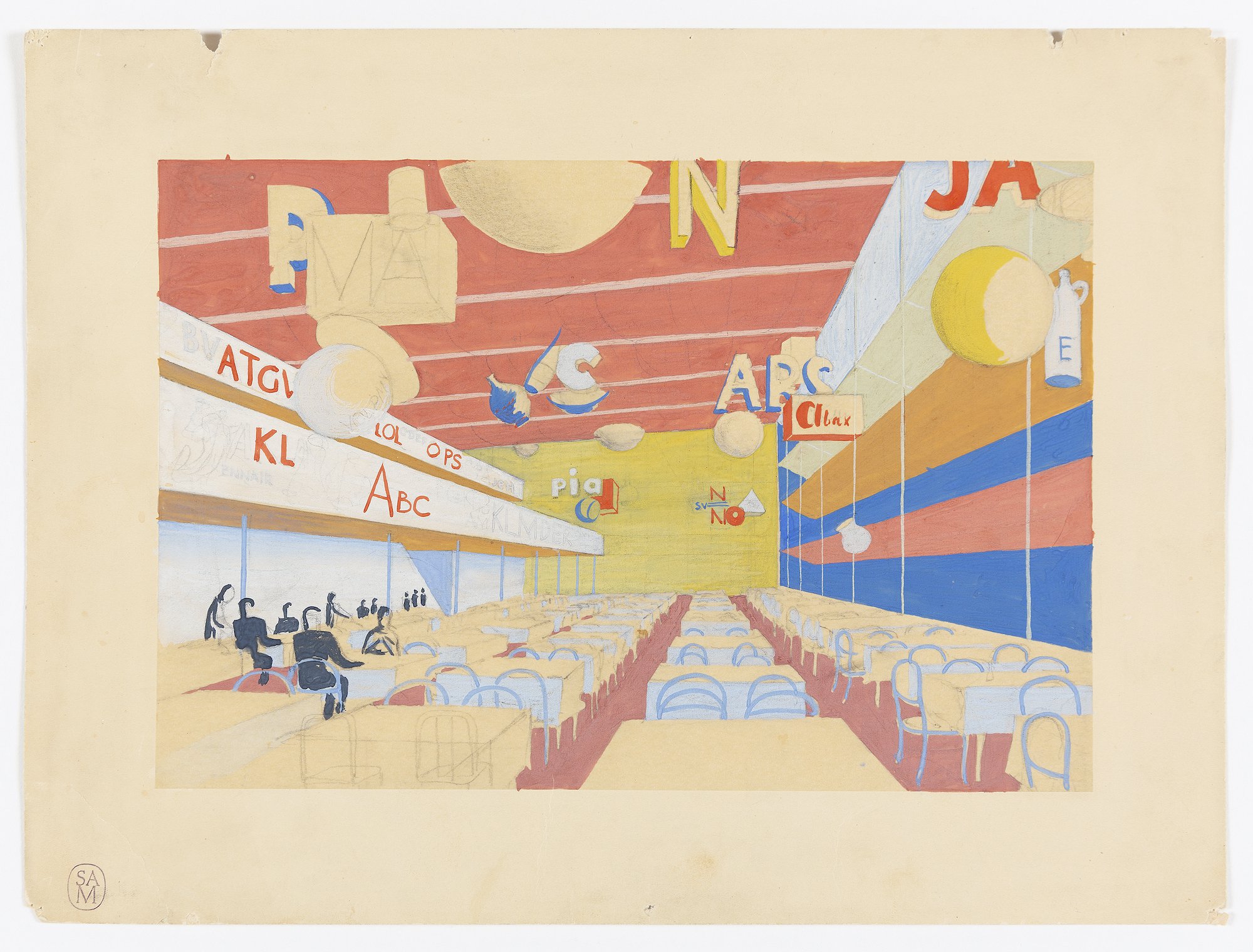
Unlike the flimsily over-scaled monumentalism of most world fairs, Erik Gunnar Asplund’s designs for the 1930 Stockholm Exhibition answered the economic constraints of the time by focusing — as the Festival of Britain would do in a similar social climate — on genuinely transitory structures. It was a rigorously edited and modernised version of the seaside bathhouse, pier and promenade: lightweight monochrome pavilions brought to architectural life by the decoration of everything around them, from seating to banners and signs. Yet the figures he adds belie the apparent generosity of the scheme. They are as colourless, uniform, solitary and inert as the poles that carry his waving flags: a view of one of the vividly ornamented cafés shows almost every diner in black and white, apart, and from behind.
About the same time, the birds-eye view of a huge covered swimming pool design for Paris reduces its swimmers to antlike figures on the ground. Twenty years further into the evolution of mass society, Rene Herbst (working with Sophie Warburg) draws on the fundamental shapes of cylinder, cone, and cube and on primary colours to organise an exposition celebrating rayon. This clearly speaks not just to the shapes and palette of the nursery but to the microscopic structure of the synthetic fibre itself, so that the Lilliputian figures he shows do not simply lend emphasis to the scale of the pavilions but are even further diminished by being such tiny creatures amidst towering elements that represent a microscopic world.
Frank Lloyd Wright uses the same Einsteinian proportions for the figures that give scale to the rendering of a sports centre in Los Angeles.
In similar dialogue with vastly blown-up geometries of the atom and the crystal, tiny torsos struggle to crest the sweeping lines of its parapets. Little stick figures — one might represent a million — were of course a commonplace of midcentury social and statistical graphics.
But one wonders, as we look at these extreme examples of a reductive approach to staffage, if the exaggerated anonymity and smallness of these dark figures are there not just to heighten the vividness and scale of their surroundings but, by being shown without any marks of type or trade or standing in society, to underline the universality of the projects’ social agendas.
Conversations: Depicting human drama
Nothing could be further from this neutral notion of staffage than the hyperactive street scene with which Paolo Posi records his design for a temporary structure for the papal festival of the Chinea. Yet, as the architect gives the open space of the city over to a catalogue of its leading street types (vicious canines not excluded), the same universal moral — that the celebration is for the delight of all society — is surely to be drawn.
There is much whimsy here: the pomp of the pavilion undermined by the way in which the human figures, one a swooning lover, mock the lounging postures of their sculpted companions. There is even more — including some mockery of the architect’s own pretension — in the way Jean-Charles Delafosse shows a proposed triumphal entry to an admiralty wharf. Both the grandiloquence of the scheme and the overweening dignity of the proud functionaries who come to admire it (the dandyish architect and his boorish clients perhaps) are equally teased by the presence of two lads who recognise the great monument only as a way to get high enough for their kite to catch the ocean breeze.
Bélanger’s 1779 presentation of a projected theatre for the Comédie Italienne shows another idea of the great social conversation. At first glance this seems to portray an impossibly overcrowded, manically animated scene until one remembers for how long the theatre was the only well-lit social space in a city after dark with any pretence of safety (there are guards with muskets in almost every corner of Bélanger’s scene). Witnesses from Samuel Pepys in Stuart London to Walt Whitman in 1850s New York talk of being there almost nightly. Here we see everything, including the courting of an actress, that went on in these complicated surroundings. Bélanger delights in showing the humans mimicking the demeanour of the statuary nearby (or are the statues mocking the humans?).
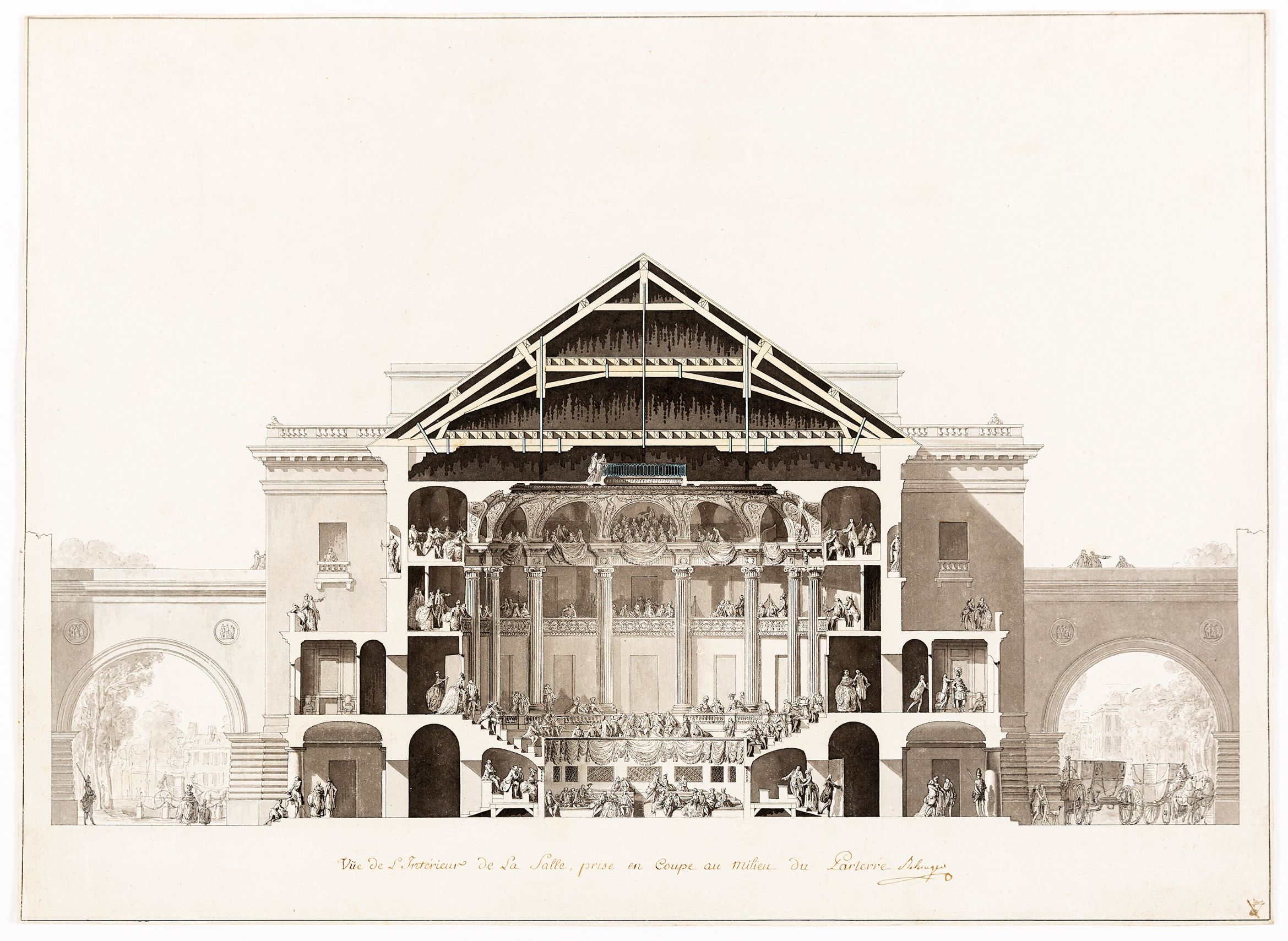
From a practical point of view this shows the particular usefulness of staffage in demonstrating the scale of ornament, clearly a simpler task when live figures could be placed against those in decoration. But there is more to it. Placing the gesturing statuary amid the living pulcinellas and columbines of the staged drama and having them all in some way mingle with the social theatre of their audience and its servants, Bélanger makes a broader Italian comedy of his own.
All these invented dramas help us see how the ornamental and spatial programmes of an eighteenth century building served — like the plays performed within them, the avenues on a philosopher’s walk or the cabinets of a grand salon, as the scenes, objects and pathways that stimulated the discourse they were intended to produce, and by those means ensured the civil amity and progress of the entire society the buildings furnished.
In their presentation of new schools, two of the great social architects of the twentieth century use a similarly careful choreography of figure to make the same point: that the construction of a sympathetic social space can construct a sympathetic society. At the first of his experimental schools in Los Angeles, Richard Neutra opened up the classroom as a space of exploration, based on play rather than instruction, in which children would form adhoc working groups as they moved between or invented activities.
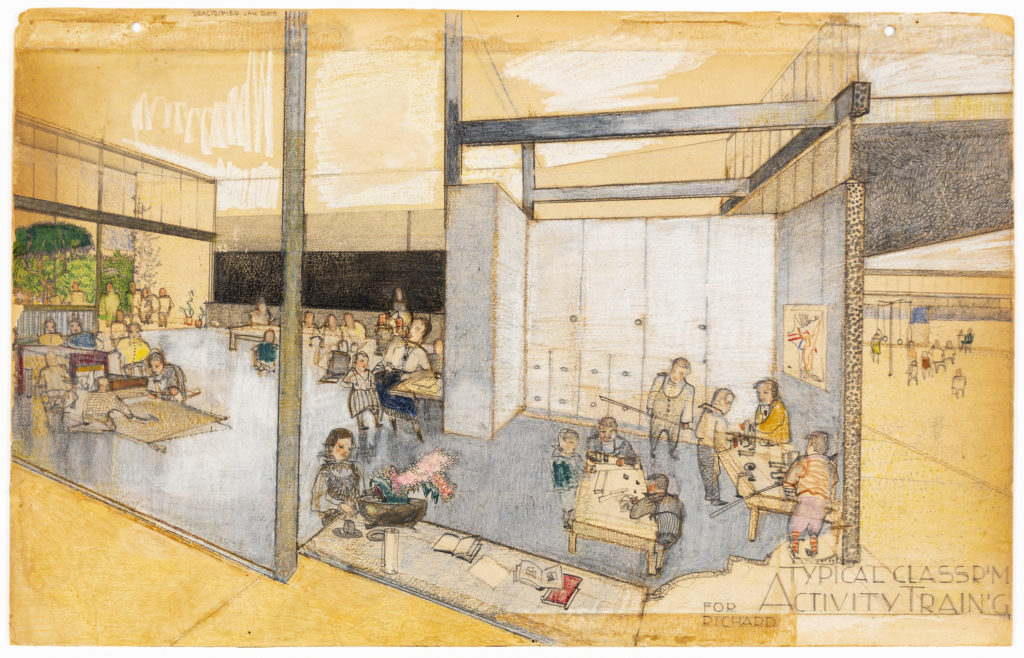
Like Giuseppe Terragni in his Asilo Sant’Elia, in Como, which probably borrowed from it, Neutra introduced a radically different sense of undiminished scale and of the widest access to the light and to out of doors so that the entire scheme – as the questing child in the foreground suggests – moved toward discovering rather than learning natural and social truths. An astonishing sheet of sketches and notes shows how Le Corbusier and his photographer constructed views of the children on the rooftop nursery school of the first Unité d’Habitation, to much the same purpose of demonstrating how to make a space of social and intellectual adventure by loosening the ways in which it determined grouping, activity and confinement.
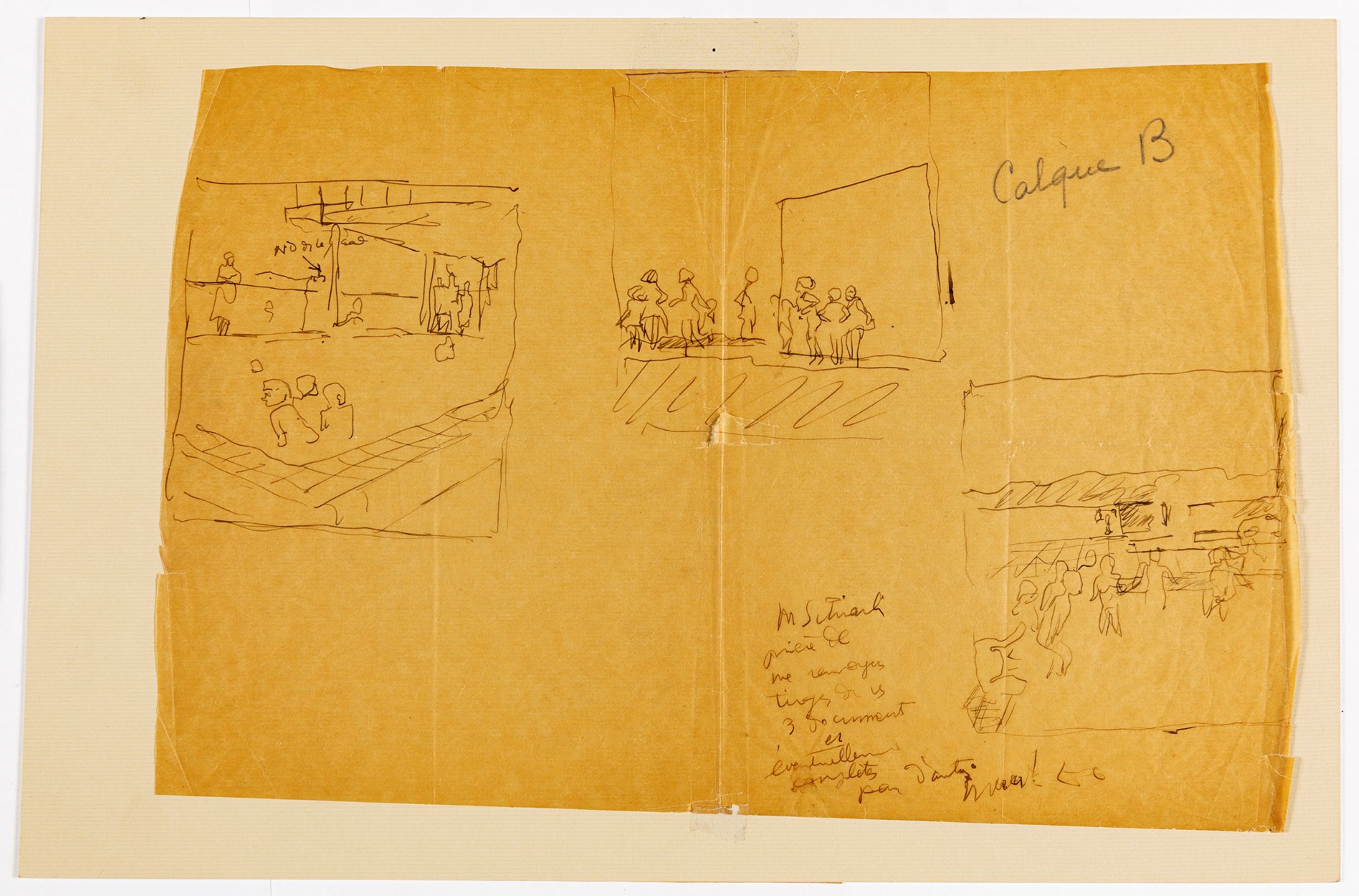
Neutra’s site of discovery was the open room and garden; Le Corbusier’s the secret caves and corners of his walls, with the wilderness of the garrigue just visible beyond.
Both are experiments in delivering the new promise that by replacing the old pedagogy with independent exploration and uninhibited social relations we would not only raise happier children but inspire great leaps forward in the scientific imagination and the construction of community.
Moods: Building an atmosphere
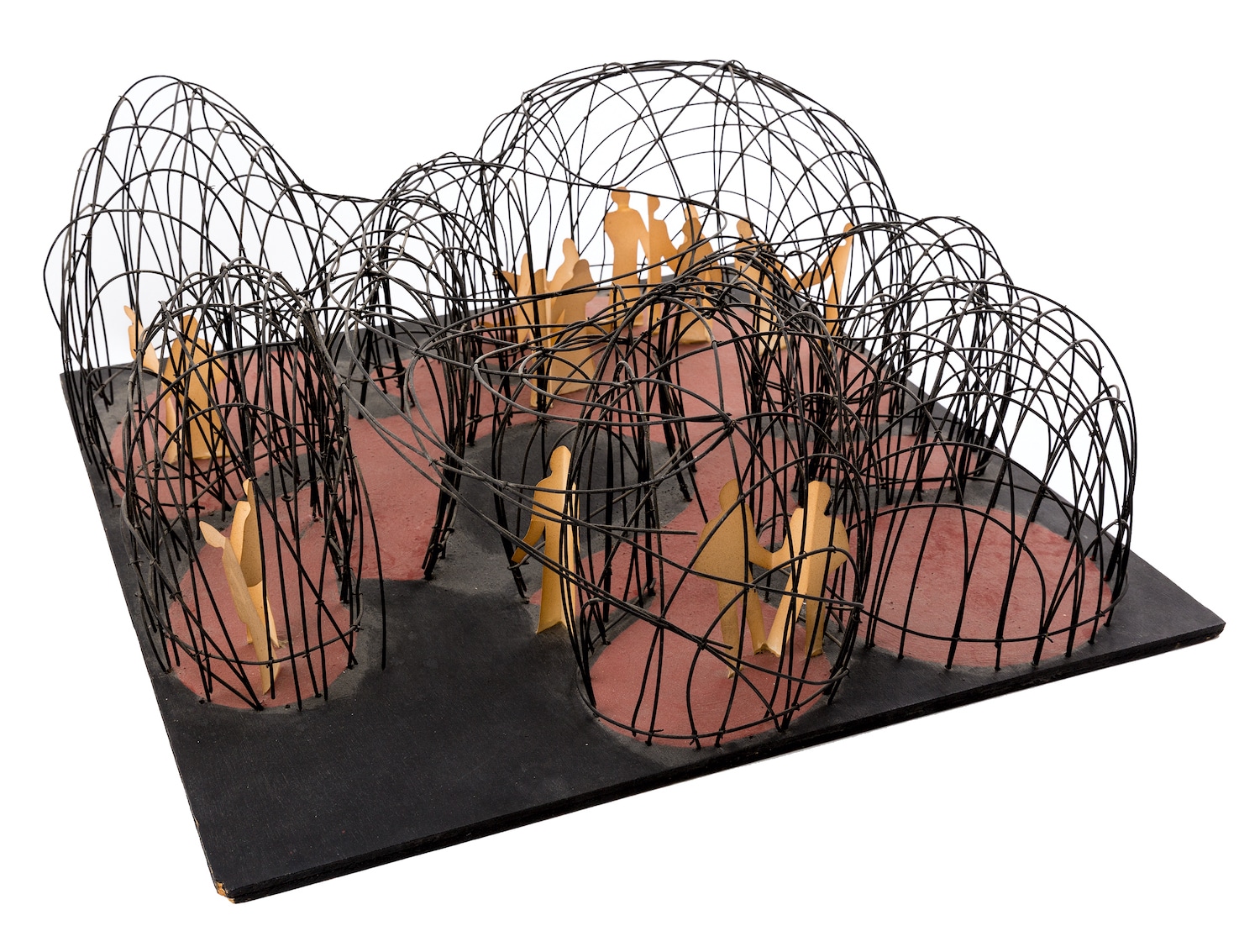
Antti Lovag described himself as an ‘habitologue’, a student of the unconscious patterns and drift of human movement and gesture. He built for adults, as Neutra and Corb did for children, spaces in which they could move their discoveries of self between the spatial, the social and the contemplative.
Lovag’s model for a ‘space of meditation and conviviality’ proposes a honeycomb of vaulted chambers contoured to his perception of the body and its movements, the scale and curve of the arches corresponding to the sweep of the human arm. While the result looks much like the inflatable buildings and bubble shelters that intrigued the technological avant-garde of the sixties, Lovag’s linked chambers have very different origins, in psychoanalytic thinking and in the contemplation of nature forms, and their purpose and sensibility is much closer to the expressionists of the twenties, to Frederick Kiesler’s Endless House, and to the fascination of surrealists for the regenerative spaces of cave, shell and womb. Neither shadow nor substance, not quite together and not quite apart, the wanderers in these cloisters echo precisely the play between singular and collective, together and apart, accident and purpose, that governs the pattern and the inkblot plan of the chambers they inhabit.
One gets a similar feeling of uncertainty about the figures used to render Ludwig Mies van der Rohe’s proposal to redesign the interior of Karl Friedrich Schinkel’s Neue Wache in Berlin as a memorial for the war dead, a monument that talks of loss through its own extraordinary emptiness. Recognising a vacancy that would be impossible to read without the vertical mourning figures that dominate it, Mies turned to an artist to portray the space, for one of the most obvious reasons for architects’ inhibitions about staffage has been the great difficulty so many find – as measurers and masters of straight line – in representing the figure.
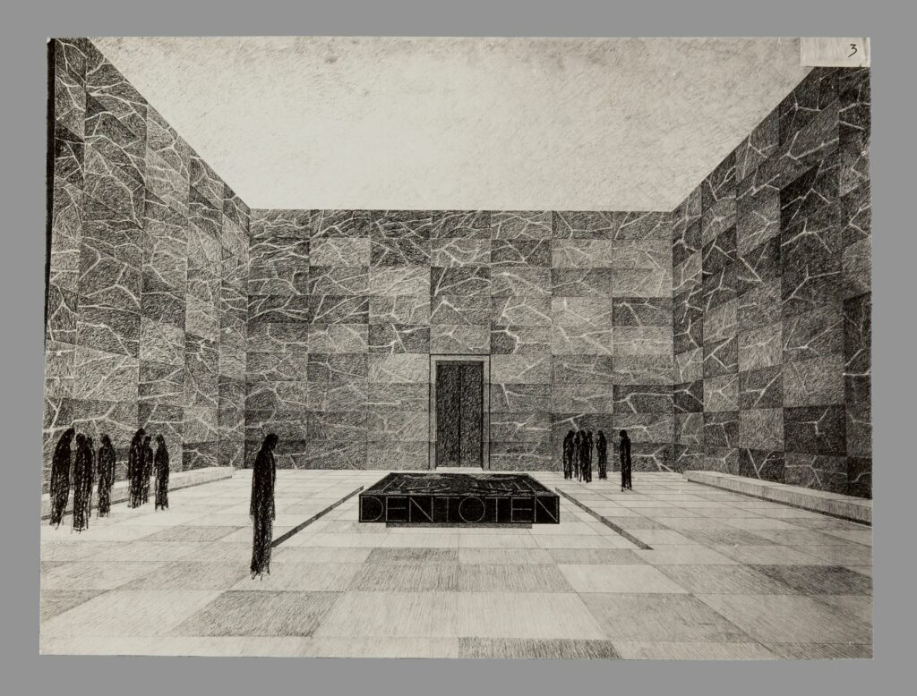
Both projects are mood chambers, and a human presence seems vital to their representation. We see similarly moody and theatrical staffage used to evoke scale in drawings for historic sites as nineteenth century architects proposed their restorations.
We can see this in the darkly medieval, slightly melancholy temper that infects a drawing by Robert Smirke for the battlements of the Tower of London, done about 1819 and apparently allied to his work on the Royal Mint. Tiny slightly rustic figures suggest the timeless characters who trudged this boundary of the city since the great keep was built: a gloomier and quite un-sunlit version of Soufflot’s pastorale.
Jean-Baptiste Lassus shows his restoration of Sainte Chapelle in Paris as it neared completion in 1838 with a medieval monk in its illuminated border and a prancing horseman in its centre, evoking the length and variety of histories and the markedly different moods that infect the environs of a sacred space. Dark-robed figures process solemnly across the foreground while a scarlet jester dances, arms akimbo, under a distant arch of the royal archives. Framing these new sites as distanced vistas, inhabiting them with figures and atmosphere that seem to move back in time, the architects lend a persuasive air of truth to history in what were really drastic interventions in the ancient fabric.
There was an era, not so long past, in which our once overcrowded cities seem to have become enchanted by the calming aesthetic and eloquent silences of the monumental void, like the barely raised platform fronting Mies’s Seagram building or the masonry deserts that framed Boston’s and Toronto’s city halls. Commissioned in 1963 to make prints to advance (and articulate) Minoru Yamasaki’s World Trade Centre, then in its first design stage, the great delineator Carlos Diniz is determined to draw its barren plaza as a site of ideal encounter and activity.
Here the introduction of staffage plays both a commercial and a polemical role, celebrating both the busyness that developers demanded of a site, and the then prevalent ideal of a universe made safe through commerce and ‘small world’ international friendship. In his efforts to sell commercial projects to tenants and financiers Diniz would go on to crowd his perspective presentations for the pioneer urban playlands of the Rouse Company with such extreme degrees of animation and so wide a variety of human types that the staffage of Posi and Bélanger is rendered almost static by comparison.
His inventive delineations of new metropolitan spaces, drawing admiringly on Gordon Cullen’s models, would do much to move the shift in perceptions of the city toward a new urbanism, in which the ‘congestion’ of the fifties became the ‘density’ of our time.
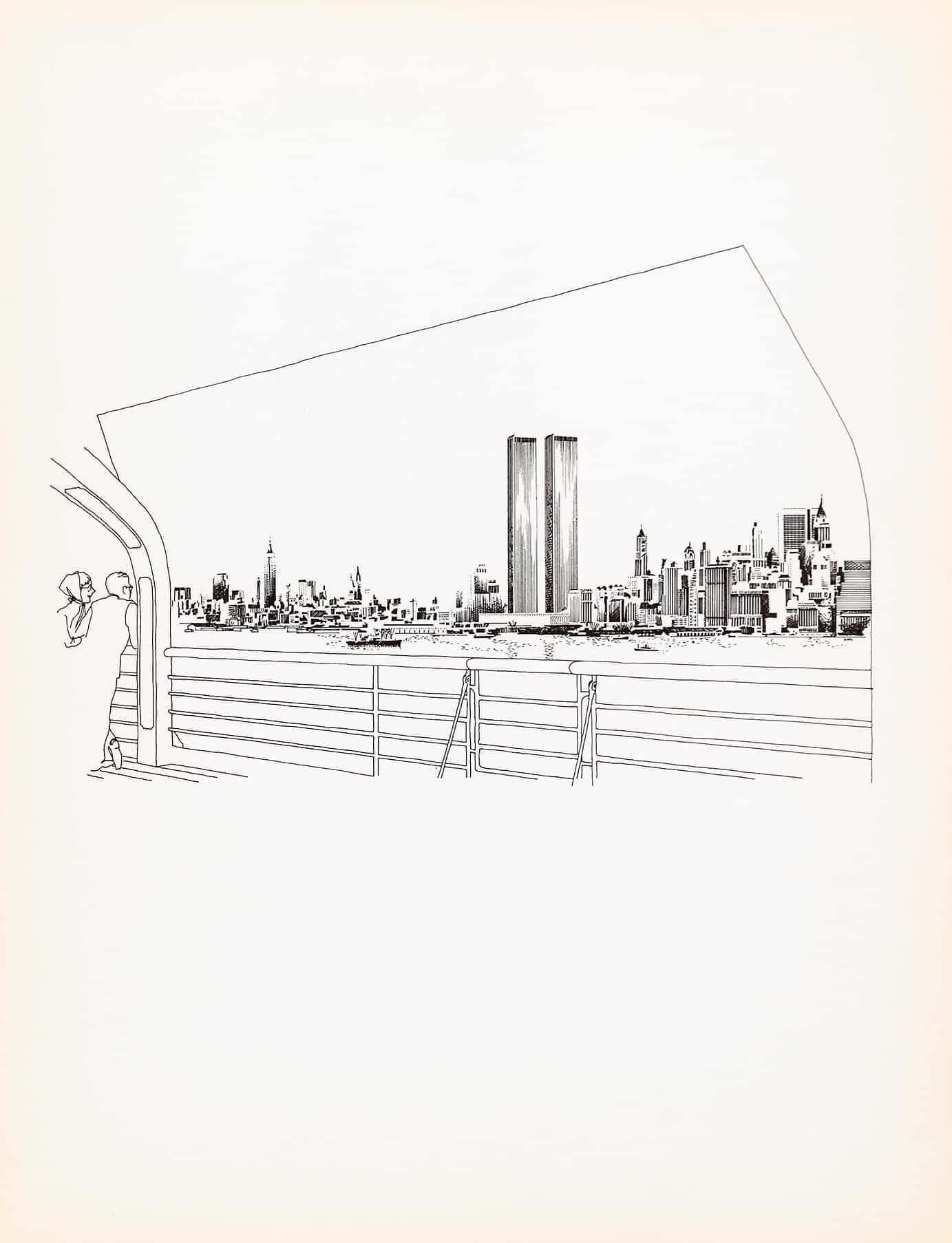
It may seem odd that a gargantuan project like the twin towers, critically damned from the start as soullessly bland and scornful of context, should have served its delineator as the battleground for one of the first great salvos in the fight to repopulate the empty space of the metropolis. Oddly touching too, because we now remember these rather boring towers very much as Diniz’s mind’s eye foresaw them.
We now recall the same lovely liquid sleekness with which he lit their surfaces and upon which his admiring foreground figures gaze, and we memorialised the thousands lost there one bright September morning in much the same vein as his staffage – as a rich and lively panoply of busy peoples.
Related...
The changing metropolis 1815–1900
– Niall Hobhouse and Nicholas Olsberg
Future Scenarios, Part I
– Niall Hobhouse and Nicholas Olsberg
Writing Prize 2020: Drawing People
– Daniel Innes
Category
drawing histories drawing techniques & materials commentaries, rants & reflections Drawing Matter archive: research & collecting
Period
c18th c19th c20th
Architect
Erik Gunnar Asplund Richard Neutra François Soufflot le Romain François-Joseph Bélanger Paolo Posi Antti Lovag Jean-Charles Delafosse Bernard Poyet Frederick Kiesler Carlos Diniz Karl Friedrich Schinkel Minoru Yamasaki René Herbst Robert Smirke Gordon Cullen D. Labouré Giuseppe Terragni Jean-Baptiste Lassus Frank Lloyd Wright Ludwig Mies van der Rohe Le Corbusier
Medium
drawing photograph
Tags
memorial & monument urban form education public space theatre section interior DMC exhibition design work on paper (series) health & leisure