Architectural Anxiety
Work on Paper, part III
– Niall Hobhouse and Nicholas Olsberg
This instalment explores the rich pathologies of architectural anxiety: the nagging pressure of what architects know and admire, or have seen and rejected. Or of what it is in the work of other architects, and in their own past practice, which they are driven always to acknowledge in the buildings they design.
Shelley fancifully maintained that all poets are engaged in the writing of one Great Poem, which Homer had begun; pushing harder, Borges claimed that poets create their own precursors. What may be true for poetry is, for architecture, largely self-evident. The buildings of previous generations are the inescapable experience of the city or of our imaginations; and, for the architects themselves, their own earlier work is always partly a catalogue of mistakes, and of missed opportunity.
It is sometimes on paper that the challenge from the past — at once a stimulus and a torment — is revealed most starkly. In a drawing, the designers can come to terms with always looking over their own shoulders, and with us peering over theirs. It is the construction of arguments, not of buildings, which are being honed and re-presented there; often, indeed, we see what are really theoretical projects, or the records and analysis of the work of others. It is clear that the draughtsman is always playing hard, and to win; but somehow it is both with and against his Borgesian precursors.
By the middle of the 1970s the volume and dissonance of influences jostling for representation did finally trigger an explosion. Each image here tells its own story of a search for historical or urban context; but all of them are equally a part of the 2,000-year prelude to post-modernism. It began not as a formal but as an intellectual movement, a search to recover irony in architecture; and, in those early days when anything was possible, it was a larger (and unintended) cultural irony that was lost.
Of course the merry band had come to praise history, but also to bury it.
Some local difficulties: Butterfield and Cadbury-Brown
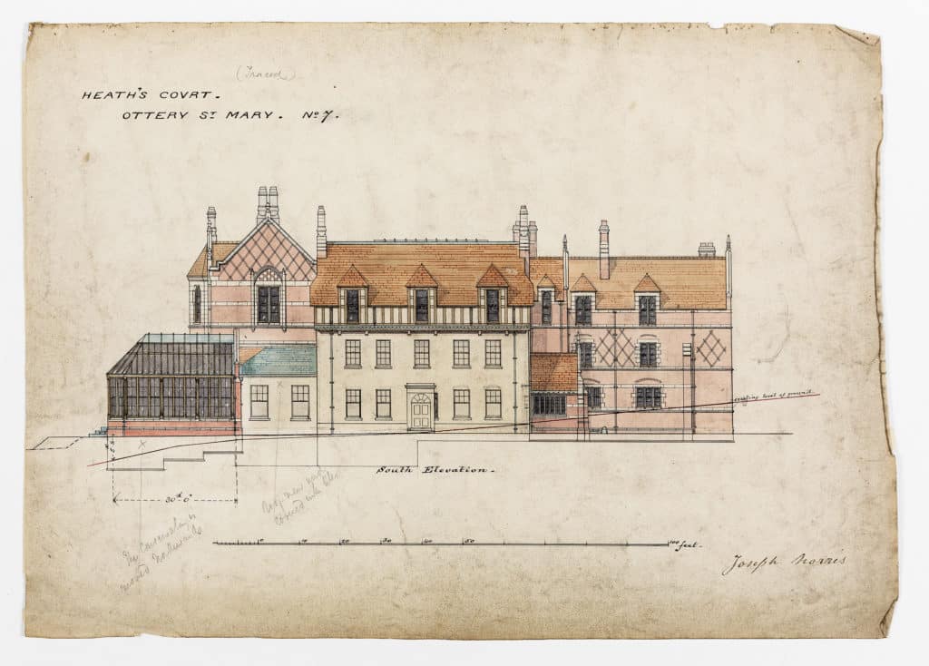
William Butterfield didn’t own a setsquare or a drawing board. He worked with draughtsmen whose forensically dull drawings kept coming back to the architect’s desk until they were ready for presentation to the client.
Heath’s Court in Devon was only the second country house in a long career of institutional building, and it represents a particular problem of his “late” style. Alterations to the five-bay 17th century house, later Georgianised, but itself built over the remains of a monastic settlement, were commissioned by Lord Chief Justice Coleridge towards the end of the careers of both architect and lawyer. The footprint of the house was to be enlarged many times, to include the addition of a library for his lordship’s 18,000 books. This was to create what was to be then the largest room in any private house west of Salisbury.
This drawing for the south facade, not fully executed, retains the rendered front of the 18th century house (and the slate roof on the one-storey extension to the west) and the rooms behind, up to the cornice level of the first floor. Above it, Butterfield precariously balances an immense, over-sailing, half-timbered third storey, very fit for the new suite of bedrooms it contained but nearly suffocating the elegant fenestration below.
This strange treatment, when combined with a new conservatory and the flank of the library to one side, and a new entrance court on the other, turns the domestic fragment into a medieval jewel held firmly in a massive Victorian setting. The estate had been in the possession of Coleridge’s family since the Dissolution. It was in a room on the first floor of the house that Cromwell and Fairfax, as they were driving the royalist forces into Cornwall, had together planned the Commonwealth. In defiance of any architectural convention, Butterfield was choosing to make for his patron a ritual gesture of antiquarian preservation.
In the early 1970s HT Cadbury-Brown was asked to extend his Royal College of Art building in west London. He proposed the demolition of five late Victorian houses and the partial appropriation of the facade of a sixth by Norman Shaw. This presentation drawing entices the public and the planners into support for an intricate contextual game.
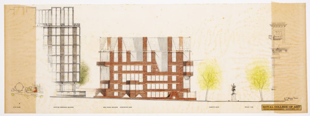
On Queen’s Gate, Cadbury-Brown was simultaneously making a response to the chimneys and red brick, the glazing patterns, and the strictly domestic rhythm of the “corridor” street, whilst adapting all of these to an institutional use as studio spaces with north facing light. The Albert Hall can be seen sweeping above the whole composition. On the elevation facing the park he was responding equally to his own building, by then 20 years old, and attempting to complete the dense composition of the urban block that stretches from the Royal Geographical Society (also by Shaw), past Albert Hall Mansions and the Albert Hall itself.
The scheme was both thoughtful and heroic, and the playful junction with Shaw’s building to the south seems breathtaking in the current conservation perspective. In the building history of London, it seems the last moment at which modernism felt it could compete with the past on anything like equal terms. The scheme ran straight into the headwinds of the Victorian Society, fuelled partly by public antagonism to the original RCA building. It was finally refused consent by Anthony Crosland, then environment secretary, overturning the recommendation of the planning inspector at appeal.
Marchionni and Mies
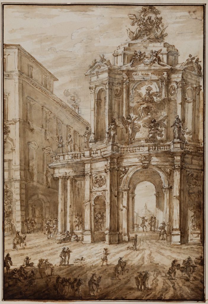
Italian architect Carlo Marchionni’s four-sided arch for the Piazzo Delle Quattro Fontane in Rome was probably planned around a visit by the Emperor Joseph II to celebrate a Hapsburg wedding. It was to stand for a few weeks astride the famous Roman crossroads, and to be thrown together out of wood, plaster, canvas and paint. In his playful presentation of the project Marchionni took even greater liberties; where Butterfield and Cadbury-Brown speak in their drawings to context,
contract and compliance, Marchionni cheekily just asks his client to share in an illusion.
In this twilight of the Roman rococo, the arch itself towers beside the massive Palazzo Albani and dwarfs the teeming melee on the street, the domed apse of Santa Maria Maggiore becomes a cupola, improbably framed within it. Even the sun, whose light floods the Via del Quirinale, appears to be shining from the north.
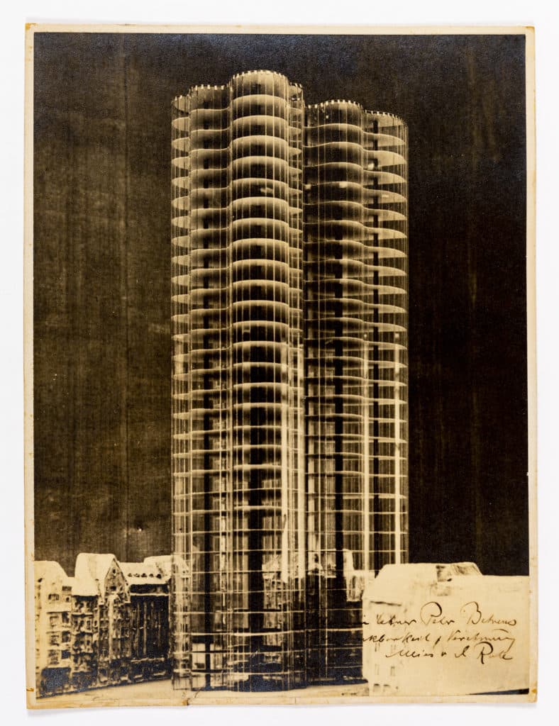
In the way of such projects, the wedding was cancelled and there is no record that the arch was ever built. Marchionni used a sheet of paper for the playful description of a monumental temporary structure. In contrast, Mies van der Rohe’s proposal for a different European city was theoretical, and his presentation forbiddingly enigmatic.
There are many mysteries about the Glass Skyscraper. Was it to be understood as actually buildable, either technically or within the contemporary Berlin building codes? Were these to be flats, or offices? Was there a particular site in mind? Above all, how does this vision for new glass architecture of light and reflection relate to the traditional buildings that surround it in the collage? Is this a modernism meant to coexist with the existing cityscape, or is the skyscraper meant to present an overpowering, even dismissive, alternative?
In the collage, the plaster facades are retarditaire and even sinister, recalling the sets of Nosferatu and The Cabinet of Dr Caligari. Oral history has it that Mies asked that the buildings should be “hideous”, and that they were intended as a generic representation of the Friedrichstrasse for which he had made another abstract proposal the year before.
As a last twist, it has been said that the form of the plaster models deliberately echoes the pre-war work of Peter Behrens, to whom this oversize version of the collage is dedicated with “gratitude and admiration”.
Mies had left Behrens’ office in 1912, taking with him the commission for the Kröller-Müller house in Holland. Are we to understand the inscription as a rapprochement, or as a triumphant vindication?
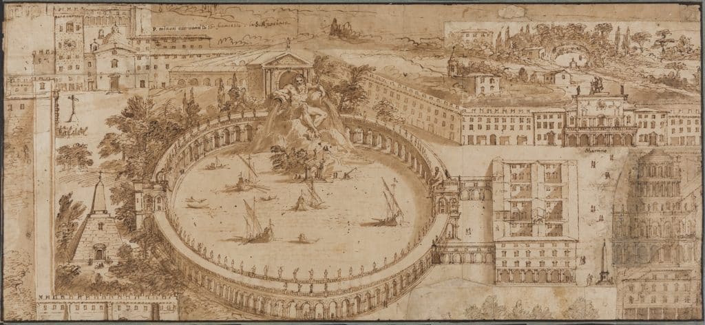
The site and description of the naval amphitheatre (naumachia), built by Domitian close to the present day Piazza Navona, was the subject of much fevered speculation in Rome in the first half of the 17th century, particularly by antiquarians in the circle of Cassiano dal Pozzo.
Domitian had been the greatest imperial builder since Augustus, and completed more than 50 buildings in the city. Murdered by his own officials in 96AD, his mystique as a patron followed directly from the damnatio memoriae immediately pronounced on him by his successor, Nerva. By its terms, Domitian’s coins and statues were melted, his arches were torn down and his name was erased from public records.
It is said that the stones of his naumachia were taken to complete the Circus Maximus. This drawing is a composite, by more than one hand and on several sheets of paper.
Its strangeness is that it carefully sets down the ancient amphitheatre between the modern Via del Corso and the Tiber, as though it might still have been standing and in operation 1,500 years after its destruction. The longhand notes identifying buildings in the contemporary city are presumably intended to add credence to the topographical accuracy of the whole mysterious exercise.
Three hundred years later Armando Brasini, favourite architect and urbanist of Mussolini, proposed another stadium to honour their German allies, complete with an inscription that explicitly refers to its being modelled on the architecture of Imperial Rome. (The inscription was ineffectively erased after the war, in embarrassment, by Brasini’s heirs.)
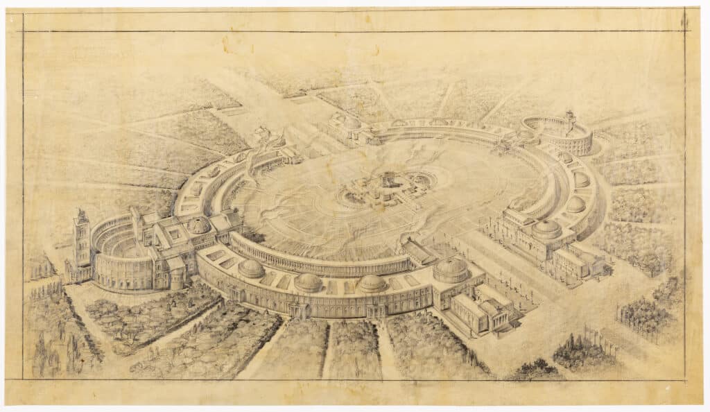
Brasini’s submission to the competition for the Palace of the Soviets in 1931 allowed Stalin’s airplane to taxi directly on to the stage of an auditorium which could seat the entire nomenklatura. The stadium shown here may have been intended as a part of Speer’s Germania plan for Berlin. In Rome he proposed a new imperial route to the Tiber that required the removal of almost everything that stood on the original site of Domitian’s naumachia.
Taraval and Soufflot build a Roman temple
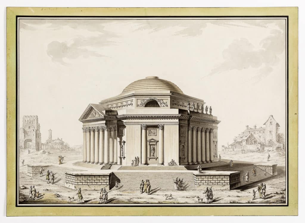
Louis-Gustave Taraval came to Paris from Sweden in 1732 and worked as an architectural draughtsman next to Etienne-Louis Boullée. The purpose of his drawing of Rome’s Temple of Minerva Medica is unclear, and the adoption of an octagonal plan for the temple is eccentric unless as a pictorial expedient that allowed the artist to propose two different frontal
treatments for the building.
Equally intriguing is the landscape context, which is similar to the devastated wilderness proposed by Brasini for the centre of Rome.
To the right we see a ruinous medieval building, on the left fragments of ancient Rome borrowed from Piranesi. The dazed figures who wander here are dressed in both fashionable 18th century garb and in Roman togas.
The building Taraval proposed is at once a superb survival of ancient Rome and the perfectly stated manifesto for a new classicism.
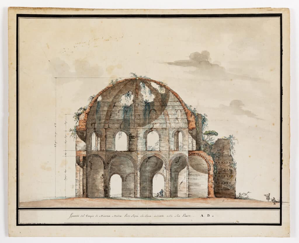
At about the same time as Taraval, French architect Jacques-Germain Soufflot was trying a subtler version of the same manoeuvre on colleagues at the Académie Française. Soufflot’s drawing, commissioned from his nephew in Rome, sets out to vindicate the revolutionary structural principles on which his own church of St Genevieve was then being slowly constructed. It does this by establishing a direct comparison with the ancient Temple of Minerva which, although in ruins, was still standing centuries after its construction.
The minutes of the Académie on that day recorded dryly that the company viewed M Soufflot’s drawings “with satisfaction” and “encourages him to continue his researches into any other singular constructions, both ancient and modern, from which useful knowledge of architecture might be gathered”.
At Soufflot’s death in 1780, two years after this presentation, the vaulting of the naves of the church was barely complete and the great technical questions that surrounded the weight of the dome were still the subject of much controversy in Paris.
In a wonderfully literal way, his drawing gives us here the precise moment, and the method, by which a particular radical architectural idea had crossed the Alps.
Gabriel and Fontaine reimagine the Forum
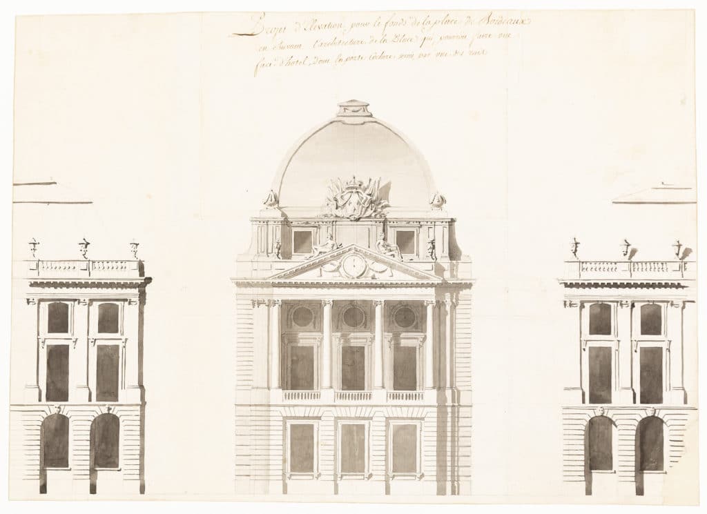
The young Soufflot was the great rival to “le grand Gabriel” in the later years of his career under the ancien régime. The Place Royale in Bordeaux, a project under the direct patronage of Louis XV inherited from Ange-Jacques Gabriel’s father, made the first breach in the old walls of Bordeaux by opening a sweeping public space to the Garonne.
The project created one of the grandest urban ensembles in France. Here, Gabriel tried to resolve the junction of the two radial medieval streets that ran into the back of the square. His particular difficulty was to create out of the narrow tapering central site a workable building whose function was suitably appropriate to its centrality in the composition. He did this in part by imposing a new central porticoed composition, essentially neo-classical in spirit, onto the baroque colonnades and pilasters of the subsidiary ranges that his father had designed, and possibly had already built.
The ranges of buildings on the north side of the Place de la Concorde are Gabriel’s urban masterpiece and in very much the same spirit as the Bordeaux project. Pierre-François-Léonard Fontaine, Napoleon’s ubiquitous neo-classical architect, here expropriates Gabriel’s flanking facades to the Rue Royale as part of his own wishful intervention in the city.
As early as 1808, he was asked by Tsar Alexander I of Russia to provide a series of watercolour views of Parisian architecture as it was evolving week by week under the First Empire. Naturally, Fontaine’s own contributions to the city that the Tsar so admired were to feature largely. In reorganising the circulation of the Place itself by adding a new fountain, and reinforcing the axis between the porticos of the Palais Bourbon across the river and La Madeleine behind him, Fontaine was both “improving” Paris and making his bid for work in St Petersburg.
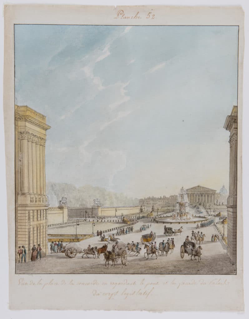
Certainly, the light in all the watercolours owes something to an imagined Gulf of Finland, and his Paris streets often seem as broad and empty as the Nevsky Prospekt.
Arguments around postmodernism: Basil Spence
On the reverse of the sheet of blotting paper on which this drawing was made is written in the careful hand of the great English architectural historian Sir Howard Colvin: “Sketch made by Sir Basil Spence at a meeting of the Royal Fine Art Commission in January 1969 to illustrate a scheme for enlarging the accommodation of MPs in the Houses of Parliament made by his assistant Christopher Libby.”
The drawing was found among Colvin’s papers at his death. As an effort to build with the past, the project stands in rather bleak contrast to HT Cadbury-Brown’s considered response for the RCA. Spence and his office still believed that history should be improved.
If this is what was being discussed in the late sixties, and in the deepest enclave of the architectural establishment, it was probably time to try something different.
Richard Bentley
English “Gothick” architecture sometimes feels like the dress rehearsal for high postmodernism, performed to an invited audience.
At Strawberry Hill from 1750, Horace Walpole and his friends were inventing a new “national” style, but it was only a tasteful elite that they needed to convince. Together they had started a (very local) rebellion against the classical forms of Palladianism, playing catch-up with picturesque landscape design as it fast became the cultural production of choice. Native English landscape needed a native architecture to ornament it.
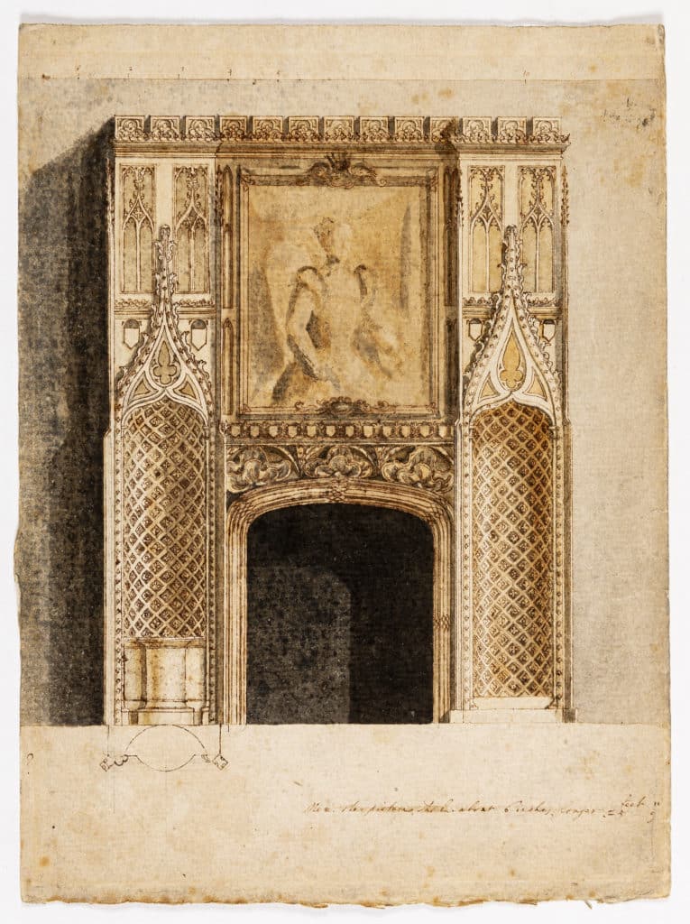
This was a game that was never in great danger of becoming serious. Here we see Richard Bentley appropriating medieval motifs to confect a chimneypiece and over-mantle, without precedent in Gothic architecture but fundamental to contemporary ideas of comfort and taste.
James Wines & SITE and Charles Moore
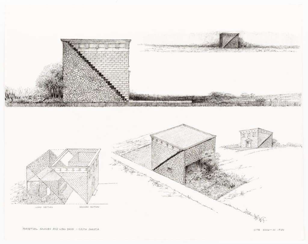
“Context is content.” James Wines’ neat mot made explicit what Learning from Las Vegas had merely suggested was possible. His proposal for the Perpetual Savings & Loan Association of South Dakota was, in the architect’s own description,“a statement of duality, with an undercurrent of architectural humour that infuses every exterior and interior detail of the structure. The physical configuration of the bank is intended to take advantage of South Dakota’s vast stretches of flat lands, as well as the state’s familiar architectural traditions. There is a ‘secure’ savings half, based on classical Greek revival bank style of the early West and a ‘creative’ loan counterpart, responsive to regional materials and landscape.”
Only a year after its bold commission of Wines, the PSL was acquired by the First Federal Savings Bank, a subsidiary of Bank West of San Francisco. Bank West’s own parent company BNP Paribas has just had its long-term credit rating downgraded by Moody’s over concerns about its exposure to Greek sovereign debt. From this short parable, it is not quite clear on which side of the history of late capitalism SITE’s proposal falls, nor of course do we know how the customers of the bank would have appreciated applying for their mortgages in a hay barn.
It is the unbuilt manifestos of architecture that always survive the longest; in one sense, this is what this article is about. Those that do get built are by definition ahead of themselves, and are often consumed by their own myths. In this respect, Charles Moore’s Piazza d’Italia managed to be both the right thing in the wrong place, and the wrong thing at the right time.
The ironies are not just the ones expressed by Moore’s Tuscan arches, towers and colonnades. Famously declared a masterpiece before it was even begun, it became, within two years of completion, the first real ruin of postmodernism. A generous effort to put architectural values back onto the street became instead the textbook example of the failure of the urban regeneration projects of that era.
It is hard to know exactly where the blame lies. The simplest account is of the failure of the property market in the wake of the Louisiana oil bust. But a project conceived as a celebration of the Italian contribution to the culture of the Deep South was also partly defeated by Mafia dominance of the New Orleans construction industry.
Moore’s lovely premise for the Piazza itself was that over time it should become a “surprise” for wanderers in a dense Mediterranean urban fabric. The buildings that were to make it into a secret never came, and the tourists that Mayor Landrieu hoped to attract merely found the Piazza harder and harder to find.
The drawing on the opposite page is for the hotel and casino projected as part of the second phase of the development. As the market wave was about to crash over the whole scheme, Moore was gleefully responding to the architectural promise of his Piazza next door. Having rephrased the urban language of Pienza and San Gimignano for the New World, he set out to invent a shiny new vernacular for Italian-American architecture.
Post Hurricane Katrina, the fountains are gushing again in the Piazza and the light bulbs have all been replaced. The proposed site of the hotel has become a parking lot.
As we see from these two projects, the problem for the first generation of postmodern architects was that the market had in the event a quite limited sense of “architectural” humour, and none at all in relation to itself.
In conclusion: a bat hat
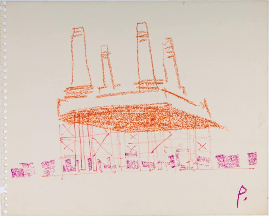
Cedric Price’s drawing for the Battersea competition of 1984 was always slated for inclusion in this article, but it wasn’t until the article was largely written that we understood so clearly why it had to be here.
His Bathat entry argued for keeping just the chimneys and the Control Room, as the only elements of the power station that were of any architectural interest or which might be missed on the London skyline. It proposed the removal of the structurally problematic brick walls of the turbine hall itself, leaving only the original steel supporting structure. The idea was that this would liberate enough land to transform the developer’s equation over the whole of the site. Price made no specific suggestions about land use, and the drawing just shows generic low-rise running uniformly outside and inside the footprint of Giles Gilbert Scott’s building.
To be fair, it is not so clear that Price could have cared less about Gilbert Scott. It is enough that it is really our own cultural preference for preservation which is being hoisted onto a rickety steel pedestal. Perhaps the drawing is opening the possibility of a complete demolition.
The drawings on the previous pages are meant as a snapshot history of the ways in which architects have tried, well and badly, to deal with the architectural past. As it appears here, Price’s Bathat does question the whole basis of the architect’s preoccupation with “influence”. It highlights usefully the self-serving absurdities, the vanity and the occasional strengths of the many arguments from the past that these drawings are trying to make.
It is perhaps worth looking again at any of them in this light, and reminding oneself that the Bathat project is the only one that proposes no actual buildings but radical demolition instead.

– Editors